Design Improvements
The final step of this project was to prioritize the feedback provided by the participants and iterate on it. Here are some of the changes I made!
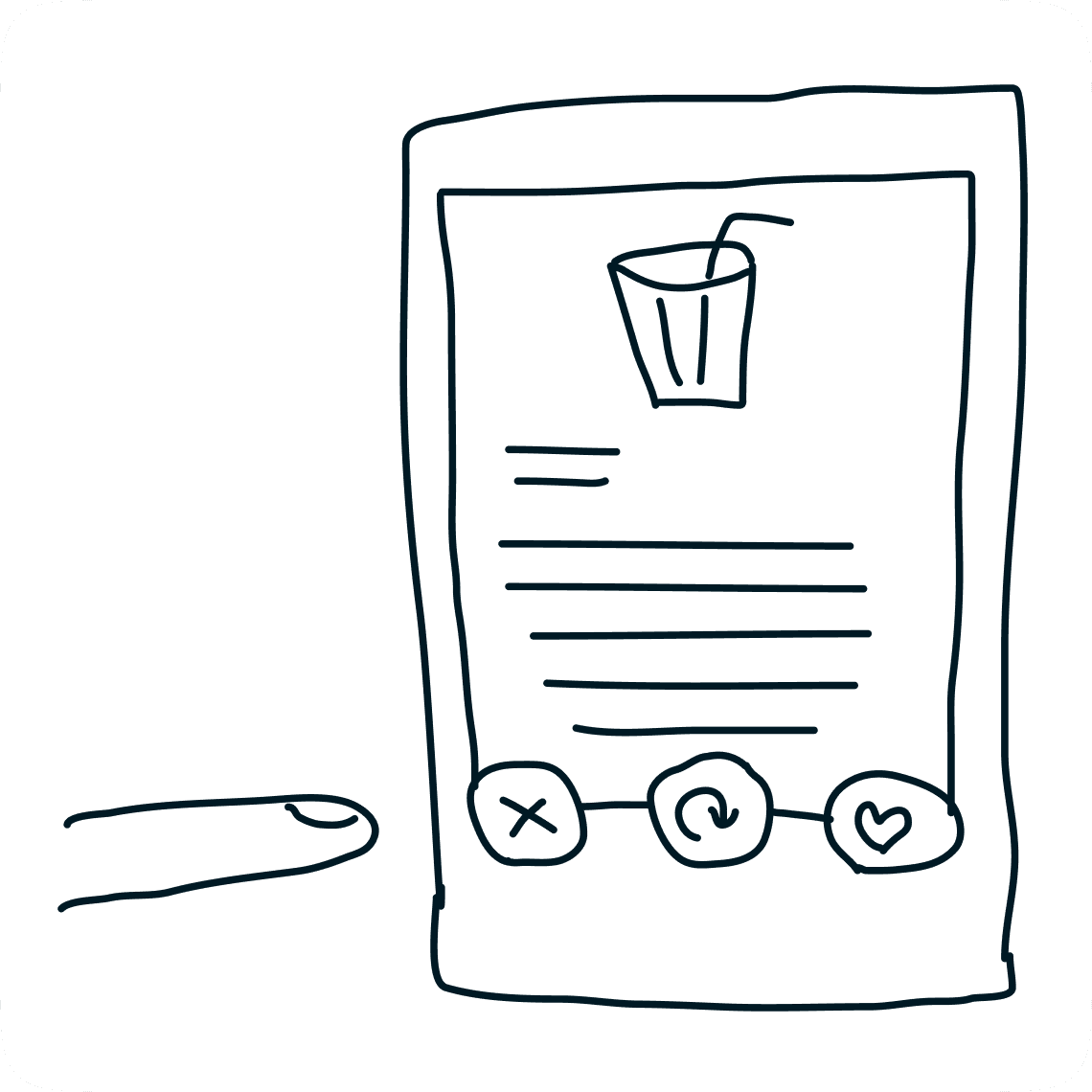
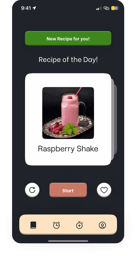
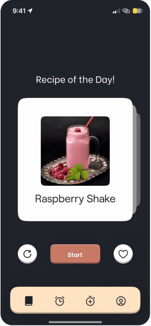
New Recipes button
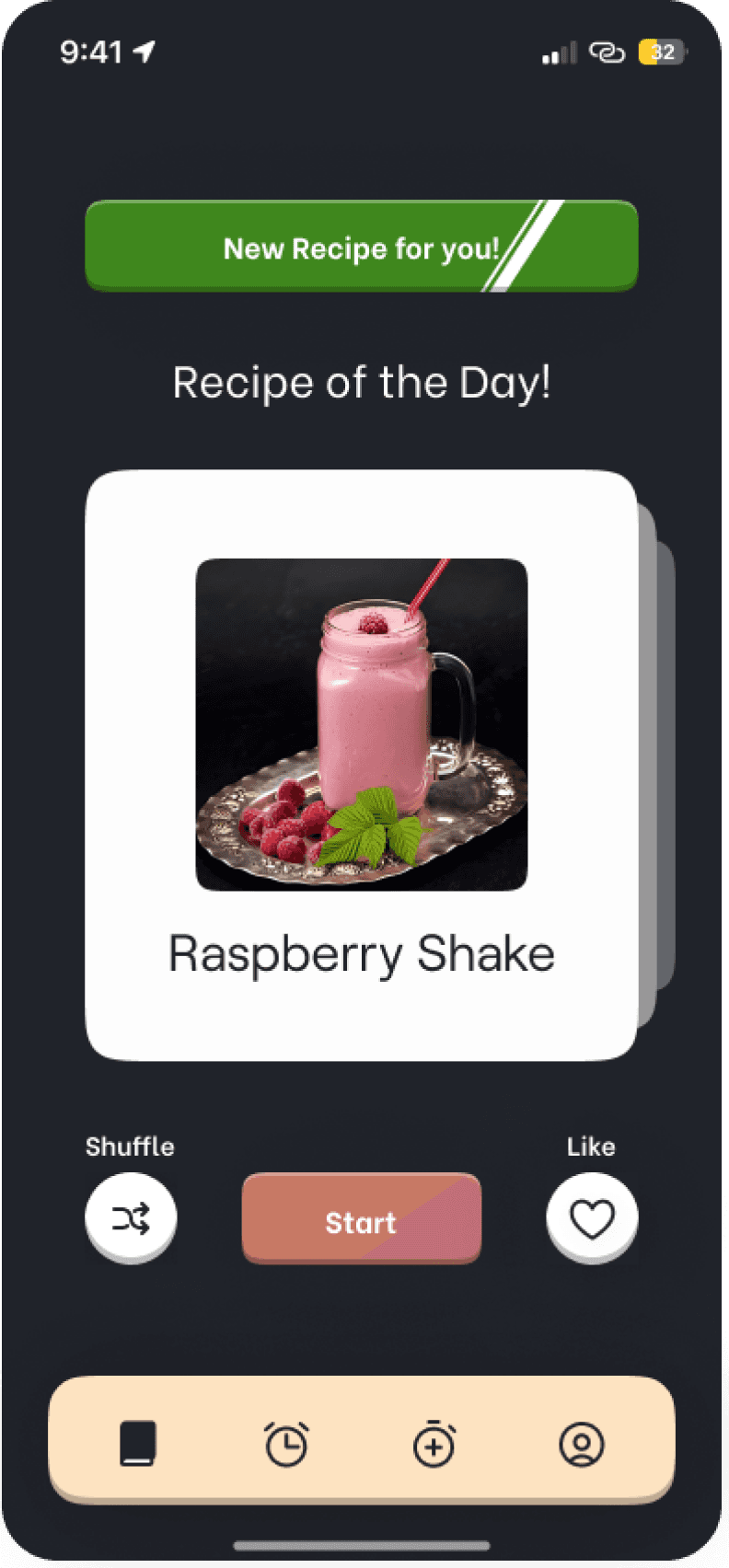
Problem
Solution
Add a shine effect animation on the new recipes button so that it stands out to the user
Based on the feedback from the participants, I
implemented this change
The new recipe button was not quite visible
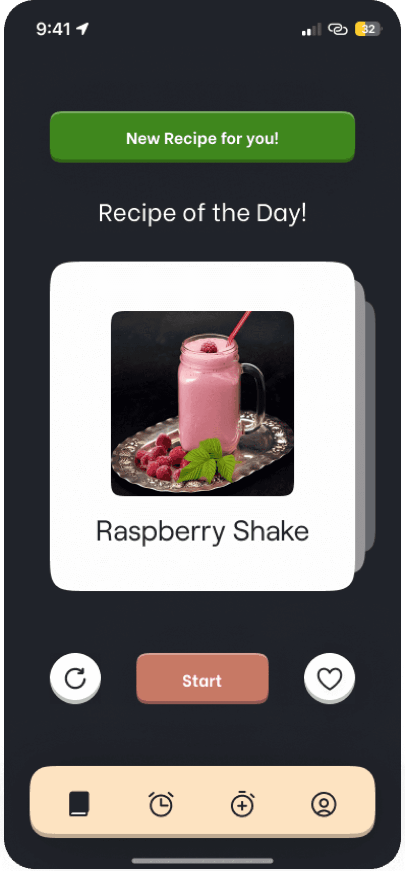
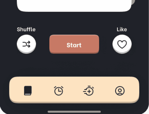
Shuffle button
Problem
Solution
Replaced the shuffle
icon with a more appropriate iconAdded text over shuffle and like buttons


Based on the feedback from the participants, I
implemented two changes
Purpose and look of the shuffle button was confusing
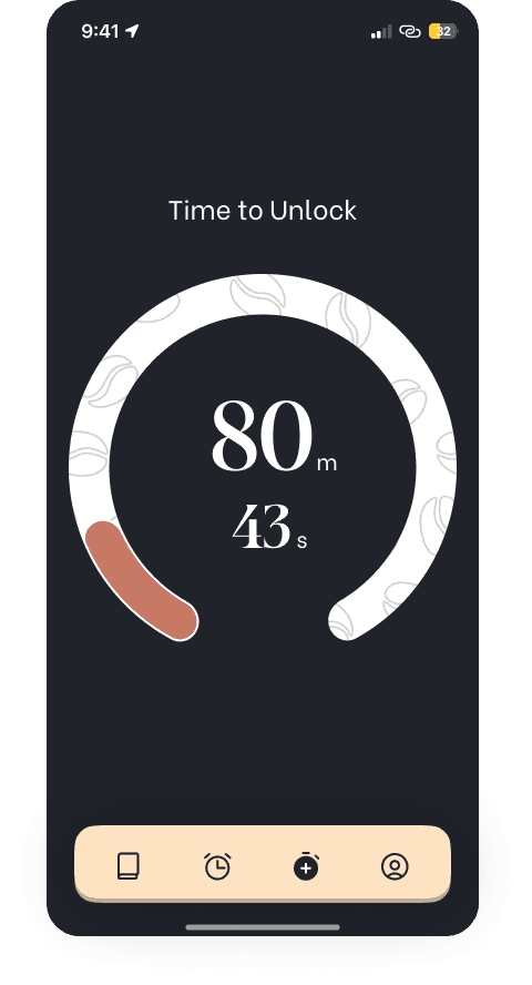
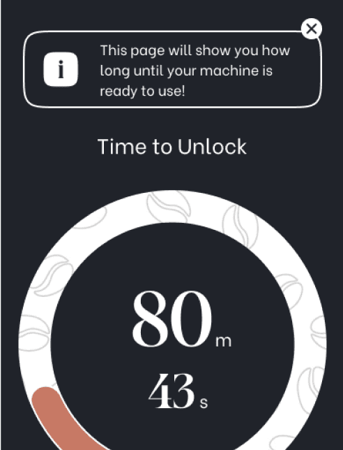
Timer Menu
Problem
Solution
Based on the feedback from the participants, I
implemented these changes
Purpose of the timer menu was not clear

Timer icon is unclear for new users
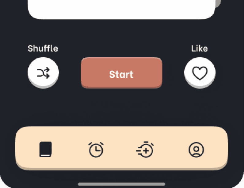

Added information about the page so that it’s purpose becomes clear to the users
Modified the timer menu icon to make it distinct and clear to new users
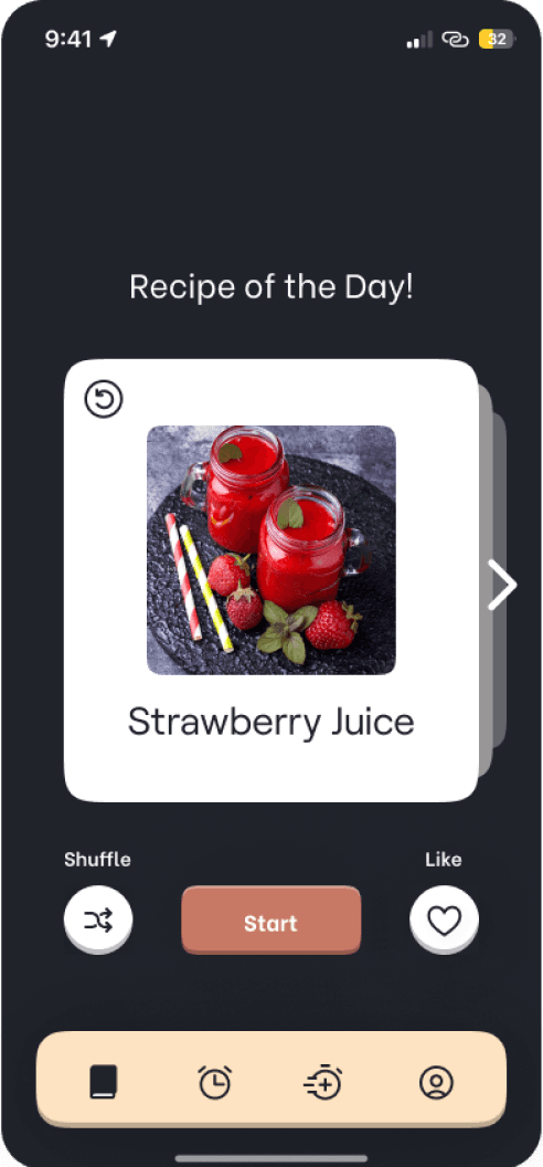
Recipe Cards
Suggestion
Design
I decided to implement this change since it seemed really intuitive


There could be a feature to go back to the previous recipe
Added a back button to the recipe cards to enable users to go back to the previous recipe
Recipe Page
Suggestion
Design
This suggestion might help new users understand the recipe cards better
There could be arrows on both sides of the images to indicate how the page works
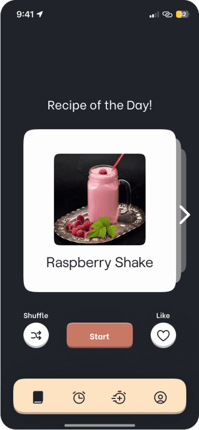
Added an animated arrow to the right of the recipe cards to indicate how shuffling works
Lock-Cup Case Study


Introduction
Jumpstart your day with a unique twist – the coffee machine locks your caffeine intake for the first 90 minutes after waking up, encouraging you to explore healthier alternatives suggested by the accompanying app.
Steps taken
Storyboarding • User Flow diagrams • Wireframes • Style Guide • High fidelity UI • Prototyping • Participant screening • Usability testing plan and execution • Analyzing data • Iterating based on feedback •
Tools used
Time taken
16 weeks
10 Jan 2024 - 8 May 2024
Problem Statement
Many people rely on coffee for a morning energy boost. However, consuming caffeine immediately after waking up might not be as effective as waiting for natural alertness mechanisms to kick in first. This is because caffeine works by blocking adenosine receptors in the brain, a chemical that promotes sleepiness. Adenosine levels are lowest right after waking, so there's less for caffeine to block. (Source here!)
How might we create a habit-forming app that helps users delay their first cup of coffee by up to 90 mins, every morning?
My extreme solution
An app that prevents you from having your first cup of coffee for 90 mins after waking up! (hence, the name) I know what you are thinking, just bare with me. The app will suggest you the recipes to some healthy alternatives while you wait for your machine to unlock.
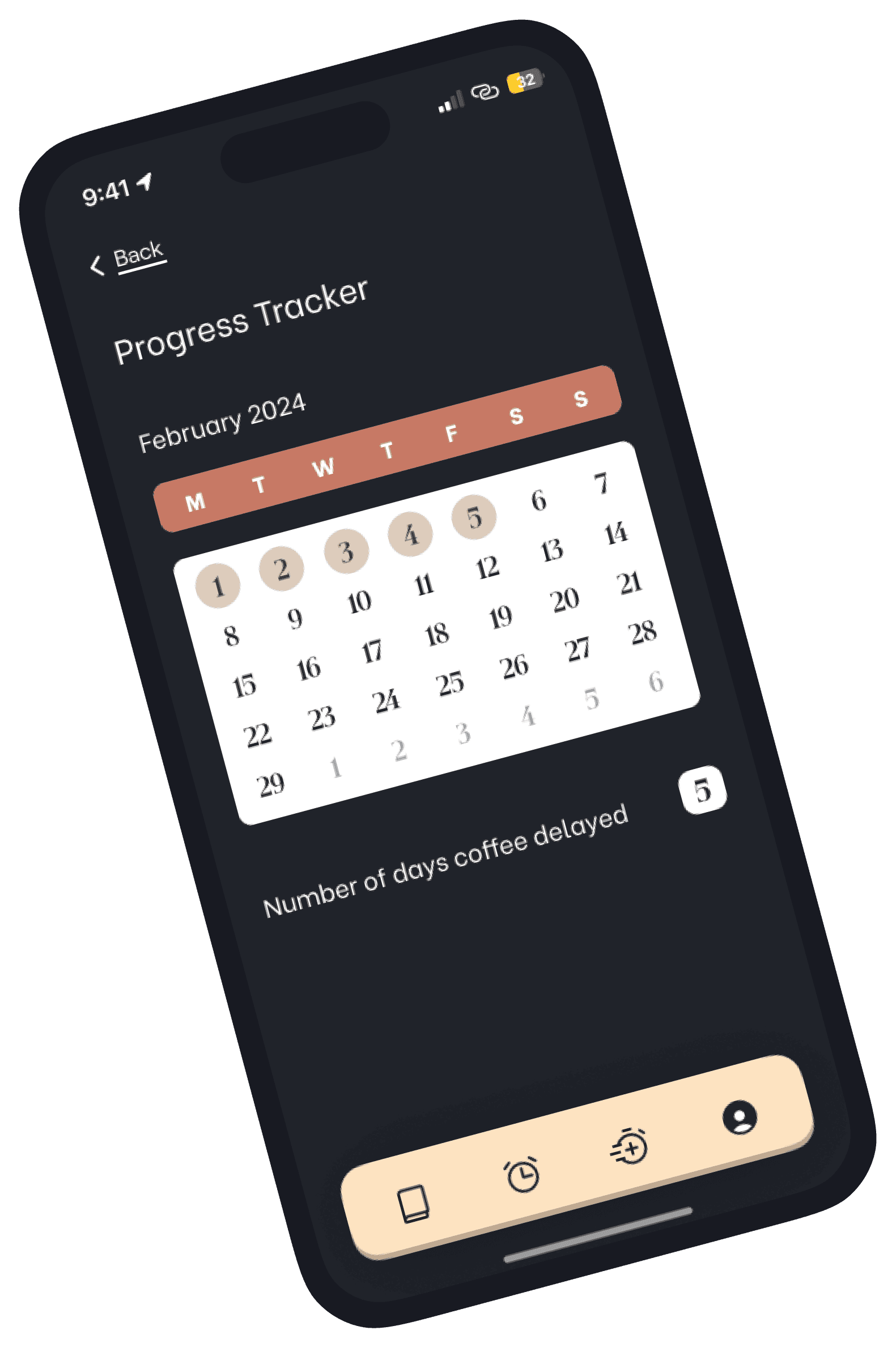
These recipes will be shown to you based on your liking. You can track your progress for the number of days you have delayed your coffee within the app.
Part I
The Design Process
Based on Nir Eyal’s book ‘Hooked: How to Build Habit-Forming Products’
The Design Story
Let’s rewind a bit to see how this project came to be!

It all started with a spinning wheel which contained different problem statements, out of which I got “Delay coffee for 90 mins”.
We then had to play card game where each player was given a set of cards to help us think of some solutions to the given problem. Out of my deck, the card I chose was “Go to great lengths to push something to it’s extreme”
Given the cards I was dealt with (pun intended), now you can probably see why I decided to lock the user’s coffee machine away!
Now, all l had to do was to design a
habit-forming app to solve this problem, how hard could it be? Oh well...

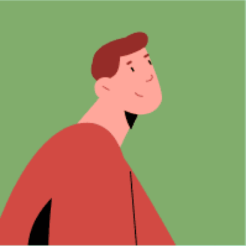
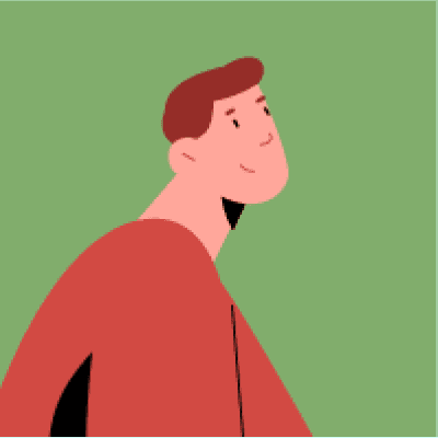
Persona
Who will I be designing for?

Developer
Age: 27
Location: Chicago
Archetype: Coffee Lover
Ryan
Tech-Savvy
Practical
Punctual
Ryan has a Master’s degree in Computer Science and works at a company in Chicago. He is a coffee lover and cannot go through his day without having at least one cup of coffee.
6:00 am - wakes up
6:00-6:10 - freshens up and makes coffee
6:10-6:30 - drinks coffee while checking emails
6:30-7:00 - works out
7:00-7:10 - takes a shower
7:10-7:30 - gets ready for work
7:30-8:00 - makes and eats breakfast
8:00 am - leaves home for work
(90 mins: 6:00-7:30 am)
Bio
Morning routine
Wants to get more out of his coffee
Wants to drink something healthier than coffee at times
Goals
Does not feel energized enough
Has a hard time deciding what to cook for his meal
Challenges
Storyboarding
Based on the book “Hooked: How to Build Habit-Forming Products” by Nir Eyal, I made a storyboard about the persona mentioned above. Here, Ryan is already a user of Lock-Cup and this storyboard follows his usual morning routine.
This storyboard follows the four core elements of the hooked model: Trigger, Action, Variable reward and Investment. Integrating these four elements in the storyboard is key to transforming the app into a habit-forming product.
Trigger
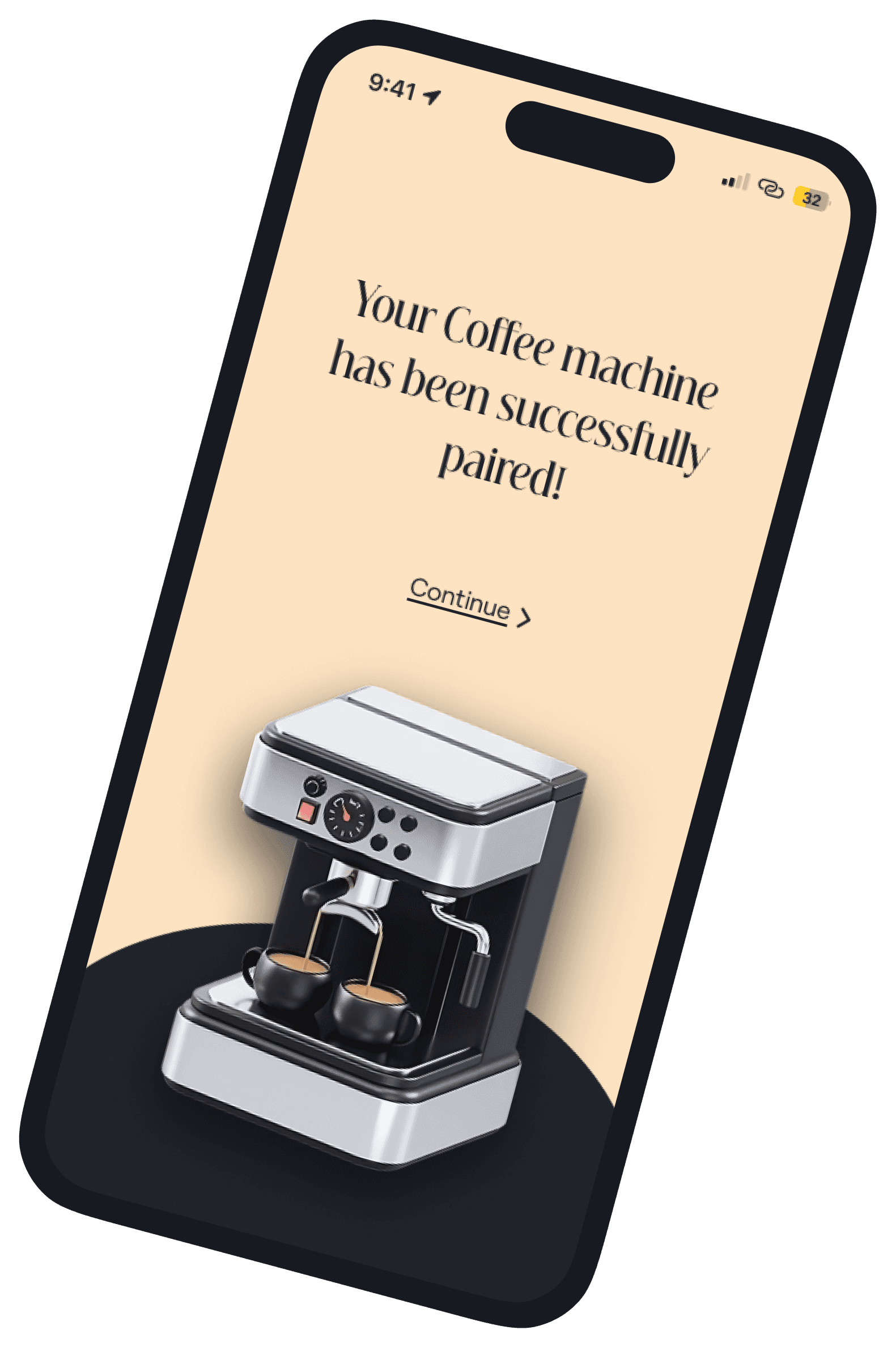
Ryan wakes up from the Lock-Cup alarm and sees that his coffee machine is locked
Action
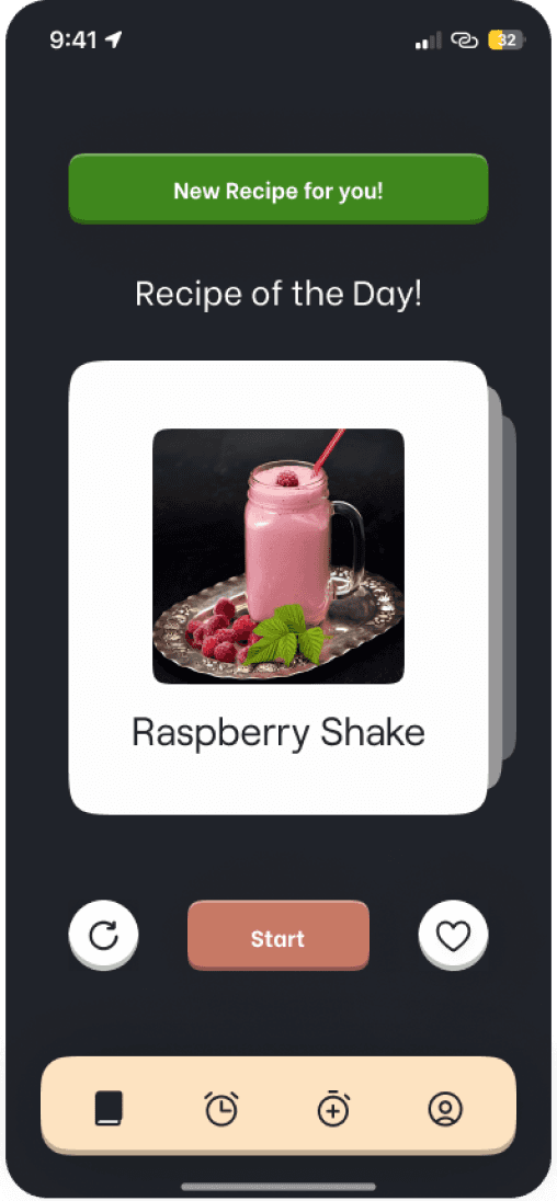
After turning the alarm off, the recipe page opens where he can either like or shuffle the recipes to tell the app what he enjoys.
Variable Reward

Ryan will now receive a new personalized recipe everyday based on his preferences!
Investment

He can track his progress within the app, to see the number of days he delayed his coffee, to create a sense of accomplishment!
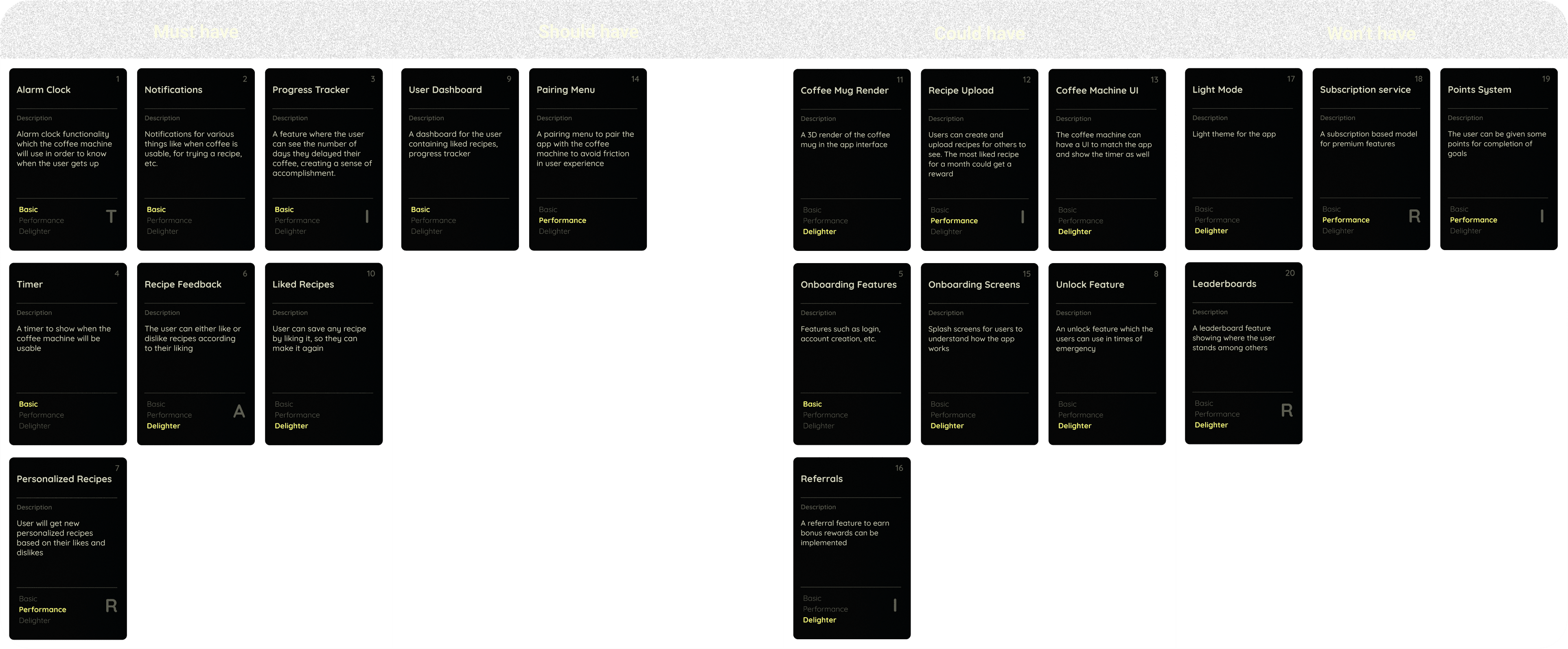
MoSCoW board
MoSCoW method is a popular prioritization technique for managing requirements of a project on hand. The acronym MoSCoW represents four categories of initiatives: must have, should have, could have, and won’t have, or will not have right now.
I implemented the Kano model and created 20 kano cards. I categorized these cards using the MoSCoW method to prioritize the features of my app. (Hover cursor to view in detail)
User Flow diagram
I created a user flow diagram to understand all the interactions to be performed by the user and also see how all the features will fall into place.
The numbers of the Kano Cards are used here to indicate how those features fit in this app.

Wireframes
In order to effectively plan the final UI of the app, the next step was to create low-fidelity wireframes for all of the screens. I first sketched some rough wireframes and later converted them into digital ones.


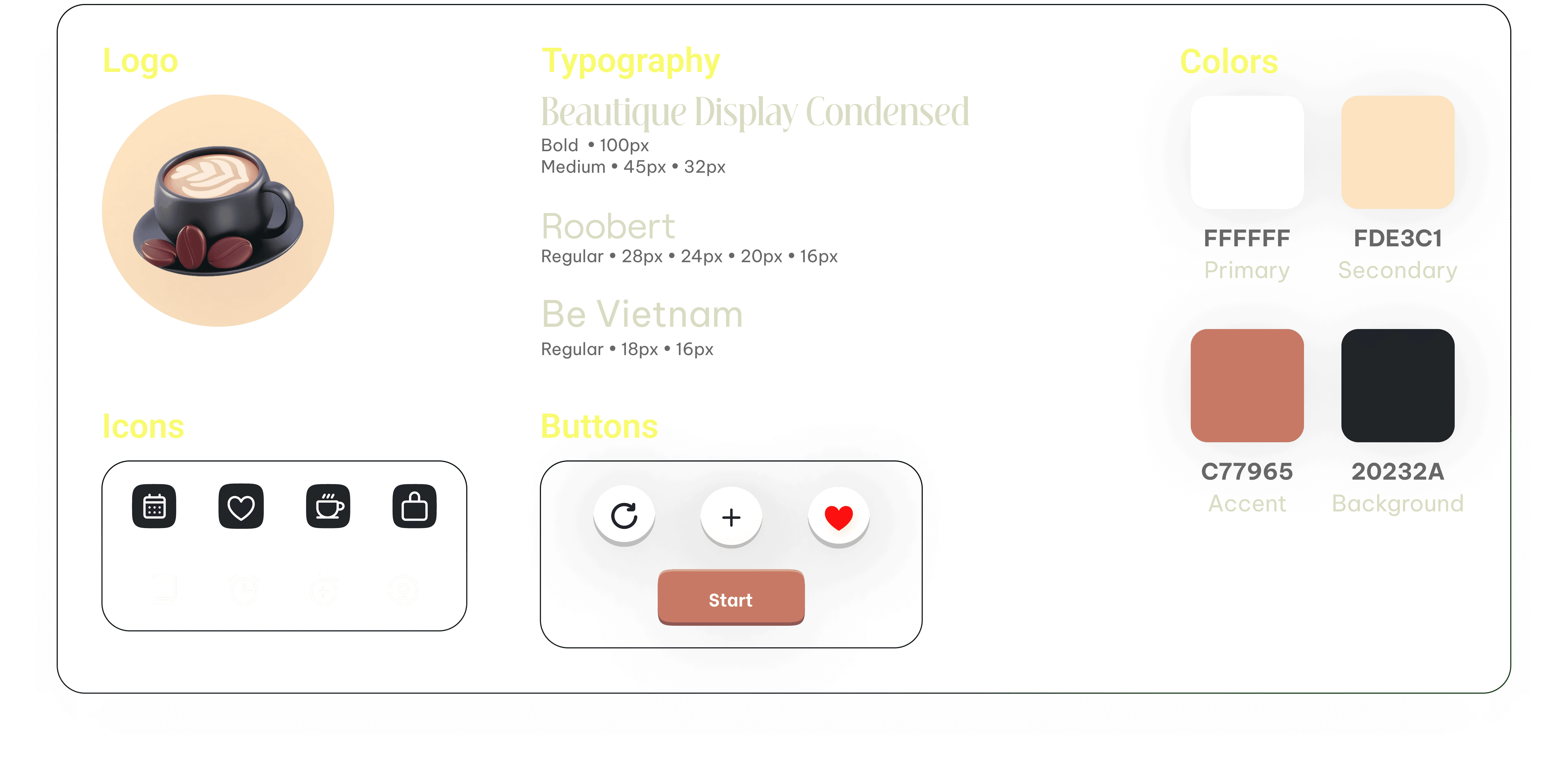
Style Guide
This is the style guide I used to create the user interface of Lock-Cup! In hindsight, I should have used one or two fonts for the entirety of this project to keep it simple, as more fonts can confuse the users. Learned it the hard way.
User Interface
Finally, coming to the UI of this project! I went with a minimal and elegant look which turned out to be really good, if I say so myself.

Part II
Usability Testing
Based on David Travis & Philip Hodgson’s book ‘Think Like a UX Researcher’.
Overview
Getting feedback from participants helped me understand what works well and what needs work in Lock-Cup. Overall, the participants liked the basic idea of the app - it can help them cut down on coffee consumption. Pairing the coffee machine turned out to be great, and users appreciated being able to track their progress.
However, some found it confusing to navigate the app, with unclear buttons (like ‘shuffle’ and ‘new recipe’) and a lack of instructions on how to use the features. Setting the alarm and using the timer were also a little confusing.
Countries
3
Completed tasks
32
Total delighters
13
Success rate
91 %
Total number
5
Testing hours
1.5
Major issues
2
Confidence & Ease
84 %
Participants
Test Data
Findings
Average Scores
Screener Survey
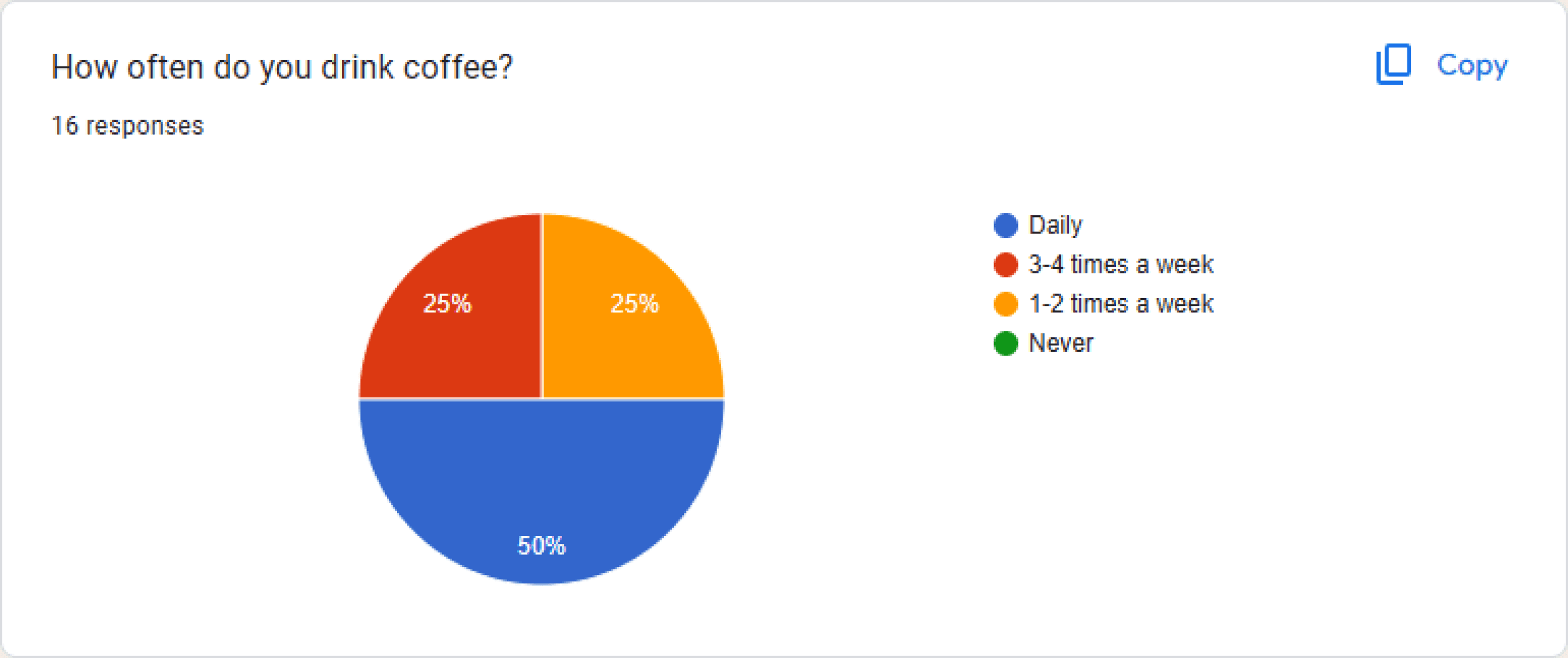
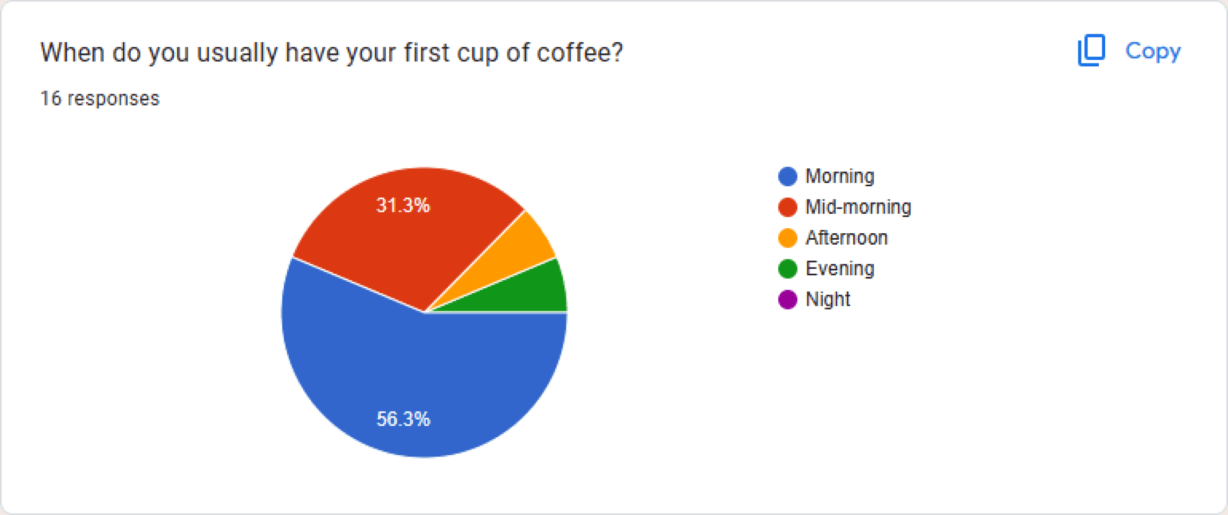
I conducted a survey using Google forms to screen users for the usability tests. This survey had 16 responses, out of which 10 agreed to participate in the usability test whereas 5 users actually showed up to the session.
I was mainly looking for people who drink coffee daily in the morning as the goal was to delay the first cup of coffee after waking up.
The participants
These were the 5 users who tested my app and provided me with some valuable feedback! (All of them were coffee lovers!) Unfortunately, I cannot share the names or recordings of these people as it would contradict the consent form filled by them.


P1
Engineer
P2
Film Maker

P3
Student

P4
Architect

P5
Developer
Usability Test plan
I created a template to conduct the usability test sessions. It consists of 7 tasks to be performed by the users. These tests lasted for 15-25 mins, however I was supposed to get them to 30 mins each. Still a lot of room for improvement!
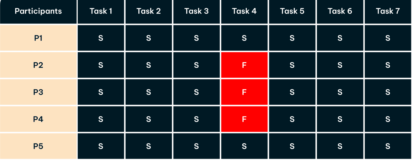
Task success rate
All of the participants were successful in completing the given tasks, except task 4, which was "Now that you have shuffled and liked the recipe you want, you will now receive personalized recipes based on it. Your task is to find these recipes within the app." Three out of four people failed to find this page because it did not stand out to them, more about this is mentioned below.

Usability Testing synthesis
After conducting all of the tests, I used affinity mapping to identify patterns in user behavior and preferences.

Frequency Matrix
I created a frequency matrix for the critical feedback to narrow down the severity (X-axis) and the frequency (Y-axis) of a particular problem
Based on the book ‘Think Like a UX Researcher’, the severity of the problem can be determined as:
Critical: This usability problem will make some users unwilling or unable to complete a common task.
Serious: This usability problem will significantly slow down some users when completing a common task and may cause users to find a workaround.
Medium: This usability problem will make some users feel frustrated or irritated but will not affect task completion.
The new recipe button was not quite visible and clear in it's purpose
Purpose and look of the shuffle button was confusing
5
4
3
Medium
Serious
Critical
Number of participants facing the problem
Severity
Low: This is a quality problem, for example a cosmetic issue or a spelling error.
We were then instructed to focus only on the issues with severity medium and above, which were observed during 3 or more usability tests.
The following were some of the issues found during the usability tests:
Low: This is a quality problem, for example a cosmetic issue or a spelling error.
We were then instructed to focus only on the issues with severity medium and above, which were observed during 3 or more usability tests.
The following were some of the issues found during the usability tests:
The new recipe button was not quite visible and clear in it's purpose to the users
Critical
The purpose and look of the shuffle button was confusing to most of the users

Serious
For some users, the purpose of the timer menu was not clear
Medium
The timer icon looked confusing to some users
Medium
- Number of users facing the issue
T - Trigger
A - Action
R - Variable reward
I - Investment
Future improvements
Here are some exciting possibilities for future versions:
Motivation Boost: Visualizing approximate adenosine levels (low, moderate, good) could motivate users to wait for the optimal brewing time, leading to a more satisfying coffee experience.
Seamless Navigation: Swipe functionality on recipe cards would offer greater user control and a more intuitive way to explore options, compared to the current shuffle button.
Personalized Coffee Journey: The ability to create, upload, and share recipes within the app would enable users to personalize their coffee experience and build a community through likes and reviews.
Onboarding Instructions: Engaging onboarding splash screens would quickly guide users through the app's functionalities and purpose, ensuring a smooth and efficient experience.
Emergency Brews: An unlock feature (usable only in emergencies) would provide flexibility for users who absolutely need coffee before the timer ends.
Lessons Learned
Lessons Learned
This project was a valuable learning experience that helped me grow as a designer and researcher. Here are some key takeaways:
Understanding Bias: Usability testing highlighted how I could influence the results by introducing some biases, as the tester. This emphasized the importance of avoiding bias to ensure the data is accurate.
Unexpected Interactions: User testing revealed how users interacted with the prototype in unexpected ways, providing crucial insights for refining the final app design.
Balancing Minimalism: The goal was to create a minimal app with core features for the hook model. However, I discovered the temptation to add various features, a challenge requiring a lot of prioritization to stay on schedule.
Thanks for reading <3
Since you made it this far, I know you have found something interesting, or maybe everything interesting?
Actively seeking internship and job opportunities!

Adarsh Mokashi
• v13
Designed and created with lots of passion and sleepless nights.
Hope to see you around!
©️ Copyrights 2024. All rights reserved
Lock-Cup Case Study
Introduction
Jumpstart your day with a unique twist! The coffee machine locks your caffeine intake for the first 90 minutes after waking up, encouraging you to explore healthier alternatives suggested by the accompanying app.
Steps taken
Storyboarding • User Flow diagrams • Wireframes • Style Guide • High fidelity UI • Prototyping • Participant screening • Usability testing plan and execution • Analyzing data • Iterating based on feedback •
Tools used
Time taken
16 weeks
10 Jan 2024 - 8 May 2024
Part I
The Design Process
Based on Nir Eyal’s book ‘Hooked: How to Build Habit-Forming Products’
Problem Statement
Many people rely on coffee for a morning energy boost. However, consuming caffeine immediately after waking up might not be as effective as waiting for natural alertness mechanisms to kick in first. This is because caffeine works by blocking adenosine receptors in the brain, a chemical that promotes sleepiness. Adenosine levels are lowest right after waking, so there's less for caffeine to block. (Source here!)
How might we create a habit-forming app that helps users delay their first cup of coffee by up to 90 mins, every morning?
My extreme solution
An app that prevents you from having your first cup of coffee for 90 mins after waking up! (hence, the name) I know what you are thinking, just bare with me. The app will suggest you the recipes to some healthy alternatives while you wait for your machine to unlock.
These recipes will be shown to you based on your liking. You can track your progress for the number of days you have delayed your coffee within the app.

Persona
Who will I be designing for?

Ryan
Developer
Age: 27
Location: Chicago
Archetype: Coffee Lover
Tech-Savvy
Practical
Punctual
Bio
Ryan has a Master’s degree in Computer Science and works at a company in Chicago. He is a coffee lover and cannot go through his day without having at least one cup
of coffee.
Morning routine
(90 mins: 6:00-7:30 am)
6:00 am - wakes up
6:00-6:10 - freshens up and makes coffee
6:10-6:30 - drinks coffee while reading
6:30-7:00 - works out
7:00-7:10 - takes a shower
7:10-7:30 - gets ready for work
7:30-8:00 - makes and eats breakfast
8:00 am - leaves home for work
Goals
Wants to get more out of his coffee
Wants to drink something healthier than coffee at times
Challenges
Does not feel energized enough
Has a hard time deciding what to cook for his meal
Persona
Who will I be designing for?
Ryan
Developer
Age: 27
Location: Chicago
Archetype: Coffee Lover
Tech-Savvy
Practical
Punctual
Bio
Ryan has a Master’s degree in Computer Science and works at a company in Chicago. He is a coffee lover and cannot go through his day without having at least one cup
of coffee.
Morning routine
(90 mins: 6:00-7:30 am)
6:00 am - wakes up
6:00-6:10 - freshens up and makes coffee
6:10-6:30 - drinks coffee while reading
6:30-7:00 - works out
7:00-7:10 - takes a shower
7:10-7:30 - gets ready for work
7:30-8:00 - makes and eats breakfast
8:00 am - leaves home for work
Goals
Wants to get more out of his coffee
Wants to drink something healthier than coffee at times
Challenges
Does not feel energized enough
Has a hard time deciding what to cook for his meal
Storyboarding
Based on the book “Hooked: How to Build Habit-Forming Products” by Nir Eyal, I made a storyboard about the persona mentioned above. Here, Ryan is already a user of Lock-Cup and this storyboard follows his usual morning routine.
This storyboard follows the four core elements of the hooked model: Trigger, Action, Variable reward and Investment. Integrating these four elements in the storyboard is key to transforming the app into a habit-forming product.
The Design Story
Let’s rewind a bit to see how this project came to be!
It all started with a spinning wheel which contained different problem statements, out of which I got “Delay coffee for 90 mins”.
We then had to play card game where each player was given a set of cards to help us think of some solutions to the given problem. Out of my deck, the card I chose was “Go to great lengths to push something to it’s extreme”.
Given the cards I was dealt with
(pun intended), now you can probably see why I decided to lock the user’s coffee machine away!
Now, all l had to do was to design a
habit-forming app to solve this problem, how hard could it be? Oh well...
User Flow diagram
I created a user flow diagram to understand all the interactions to be performed by the user and also see how all the features will fall into place.
The numbers of the Kano Cards are used here to indicate how those features fit in
this app. (Click to view details)

MoSCoW board
MoSCoW method is a popular prioritization technique for managing requirements of a project on hand. The acronym MoSCoW represents four categories of initiatives: must have, should have, could have, and won’t have, or will not have right now.
I implemented the Kano model and created 20 kano cards. I categorized these cards using the MoSCoW method to prioritize the features of my app. (Click to view details)
Wireframes
In order to effectively plan the final UI of the app, the next step was to create low-fidelity wireframes for all of the screens. I first sketched some rough wireframes and later converted them into digital ones.
Style Guide
This is the style guide I used to create the user interface of Lock-Cup! In hindsight, I should have used one or two fonts for the entirety of this project to keep it simple, as more fonts can confuse the users. Learned it the hard way.

Logo
Typography
Beautique Display
Condensed
Bold • 100px
Medium • 45px • 32px
Roobert
Regular
28px • 24px • 20px • 16px
Be Vietnam
Regular
18px • 16px
Colors
FFFFFF
Primary
FDE3C1
Secondary
C77965
Accent
20232A
Background
Icons
Buttons
Logo
Typography
Beautique Display
Condensed
Bold • 100px
Medium • 45px • 32px
Roobert
Regular
28px • 24px • 20px • 16px
Be Vietnam
Regular
18px • 16px
Colors
FFFFFF
Primary
FDE3C1
Secondary
C77965
Accent
20232A
Background
Icons
Buttons
User Interface
Finally, coming to the UI of this project! I went with a minimal and elegant look which turned out to be really good, if I say so myself.


Part II
Usability Testing
Based on David Travis & Philip Hodgson’s book ‘Think Like a UX Researcher’.
Overview
Countries
3
Completed tasks
32
Total delighters
13
Success rate
91 %
Total number
5
Testing hours
1.5
Major issues
2
Confidence & Ease
84 %
Participants
Test Data
Findings
Average Scores
Getting feedback from participants helped me understand what works well and what needs work in Lock-Cup. Overall, the participants liked the basic idea of the app - it can help them cut down on coffee consumption. Pairing the coffee machine turned out to be great, and users appreciated being able to track their progress.
However, some found it confusing to navigate the app, with unclear buttons (like ‘shuffle’ and ‘new recipe’) and a lack of instructions on how to use the features. Setting the alarm and using the timer were also a little confusing.
Screener Survey
I conducted a survey using Google forms to screen users for the usability tests. This survey had 16 responses, out of which 10 agreed to participate in the usability test whereas 5 users actually showed up to the session. I was mainly looking for people who drink coffee daily in the morning as the goal was to delay the first cup of coffee after waking up.


See Consent Form
The participants
These were the 5 users who tested my app and provided me with some valuable feedback! (All of them were coffee lovers!) Unfortunately, I cannot share the names or recordings of these people as it would contradict the consent form filled by them.
Usability Test plan
I created a template to conduct the usability test sessions. It consists of 7 tasks to be performed by the users. The tests lasted for 15-25 mins, however I was supposed to get them to 30 mins each. Still a lot of room for improvement!
Usability Test synthesis
After conducting all of the tests, I used affinity mapping to identify patterns in user behavior and preferences.
Task success rate
All of the participants were successful in completing the given tasks, except task 4, which was "Now that you have shuffled and liked the recipe you want, you will now receive personalized recipes based on it. Your task is to find these recipes within the app." Three out of four people failed to find this page because it did not stand out to them, more about this is mentioned below.
Frequency Matrix
The new recipe button was not quite visible and clear in it's purpose
Purpose and look of the shuffle button was confusing
5
4
3
Medium
Serious
Critical
Number of participants facing the problem
Severity
I created a frequency matrix for the critical feedback to narrow down the severity (X-axis) and the frequency (Y-axis) of a particular problem
Based on the book ‘Think Like a UX Researcher’, the severity of the problem can be determined as:
Critical: This usability problem will make some users unwilling or unable to complete a common task.
Serious: This usability problem will significantly slow down some users when completing a common task and may cause users to find a workaround.
Medium: This usability problem will make some users feel frustrated or irritated but will not affect task completion.
Low: This is a quality problem, for example a cosmetic issue or a spelling error.
We were then instructed to focus only on the issues with severity medium and above, which were observed during 3 or more usability tests.
The following were some of the issues found during the usability tests:
- Number of users facing the issue
The new recipe button was not quite visible and clear in it's purpose to the users
Critical
The purpose and look of the shuffle button was confusing to most of the users
Serious
For some users, the purpose of the timer menu was not clear
Medium
The timer icon looked confusing to some users
Medium
Lessons Learned
This project was a valuable learning experience that helped me grow as a designer and researcher. Here are some key takeaways:
Understanding Bias: Usability testing highlighted how I could influence the results by introducing some biases, as the tester. This emphasized the importance of avoiding bias to ensure the data is accurate.
Unexpected Interactions: User testing revealed how users interacted with the prototype in unexpected ways, providing crucial insights for refining the final app design.
Balancing Minimalism: The goal was to create a minimal app with core features for the hook model. However, I discovered the temptation to add various features, a challenge requiring a lot of prioritization to stay on schedule.
Future improvements
Here are some exciting possibilities for future versions:
Motivation Boost: Visualizing approximate adenosine levels (low, moderate, good) could motivate users to wait for the optimal brewing time, leading to a more satisfying coffee experience.
Seamless Navigation: Swipe functionality on recipe cards would offer greater user control and a more intuitive way to explore options, compared to the current shuffle button.
Personalized Coffee Journey: The ability to create, upload, and share recipes within the app would enable users to personalize their coffee experience and build a community through likes
and reviews.Onboarding Instructions: Engaging onboarding splash screens would quickly guide users through the app's functionalities and purpose, ensuring a smooth and efficient experience.
Emergency Brews: An unlock feature (usable only in emergencies) would provide flexibility for users who absolutely need coffee before the
timer ends.
Design Improvements
The final step of this project was to prioritize the feedback provided by the participants and iterate on it. Here are some of the changes I made!
New Recipes button
Problem
The new recipe button was not quite visible

Solution
Add a shine effect animation on the new recipes button so that it stands out to the user
Based on the feedback from the participants, I
implemented this change
Shuffle button
Problem

Purpose and look of the shuffle button was confusing
Solution
Replaced the shuffle
icon with a more appropriate iconAdded text over shuffle and like buttons

Based on the feedback from the participants, I
implemented two changes
Timer Menu
Problem
Purpose of the timer menu was not clear
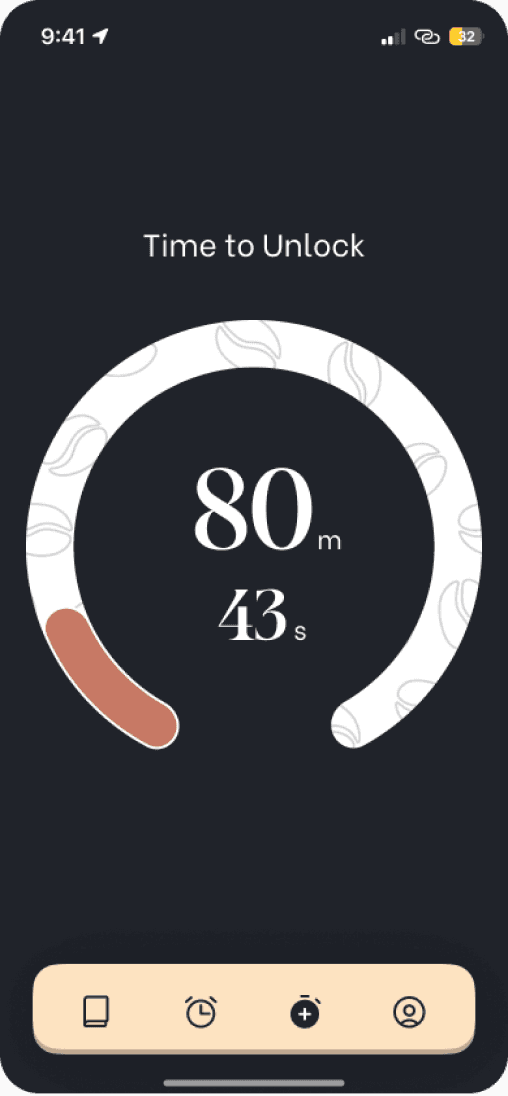
Timer icon is unclear for new users
Solution
Added information about the page so that it’s purpose becomes clear to the users
Modified the timer menu icon to make it distinct and clear to new users
Based on the feedback from the participants, I
implemented these changes
Recipe Cards
Suggestion
There could be a feature to go back to the previous recipe
Design
I decided to implement this change since it seemed really intuitive
Added an undo button to the recipe cards to enable users to go back to the previous recipe
Recipe Page
Suggestion
There could be arrows on both sides of the images to indicate how the page works
Design
This suggestion might help new users understand the recipe cards better

Added an animated arrow to the right of the recipe cards to indicate how shuffling works
Thanks for reading <3
Since you made it this far, I know you have found something interesting, or maybe everything interesting?
Actively seeking internship and job opportunities!

Back to top


P1
Engineer
P1
Engineer
P2
Film Maker
P2
Film Maker

P3
Student
P3
Student

P4
Architect
P4
Architect

P5
Developer
P5
Developer
Adarsh Mokashi
• v13
Designed and created with lots of passion and sleepless nights.
Hope to see you around!
©️ Copyrights 2024. All rights reserved
Adarsh Mokashi
• v13
Designed and created with lots of passion and sleepless nights.
Hope to see you around!
©️ Copyrights 2024. All rights reserved
Trigger
Ryan wakes up from the Lock-Cup alarm and sees that his coffee machine is locked
Action
After turning the alarm off, the recipe page opens where he can either like or shuffle the recipes to tell the app what he enjoys.
Variable Reward
Ryan will now receive a new personalized recipe everyday based on his preferences!
Investment
He can track his progress within the app, to see the number of days he delayed his coffee, to create a sense of accomplishment!