A behavioral
product to delay
caffeine and
turn hesitation
A behavioral product to delay
caffeine and turn hesitation into habit
into habit
Academic Project
16 weeks
Jan 2024
Role: Product Designer

Impact
Impact
Results from Usability Testing
Results from Usability Testing
Tasks per Test
7
Major Issues
2
Success Rate
91%
Context
Context
Most people reach for coffee the moment they wake up but it's not giving them the energy they expect
Most people reach for coffee the moment they wake up but it's not giving them the energy they expect
Caffeine works by blocking adenosine, the chemical that makes you feel sleepy. Right after waking, adenosine levels are naturally low, which means coffee’s effects are minimal. Research shows that waiting about 90 minutes before your first cup can make caffeine noticeably more effective.
The challenge is that morning routines are deeply ingrained and hard to change.
Lock-Cup is my solution. It is a mobile app paired with a smart coffee machine that stays locked for 90 minutes after waking. The product focuses on support, not restriction. Through small nudges like personalized drink recipes, progress tracking, and gentle reminders, Lock-Cup helps users build a healthier morning rhythm while keeping coffee as a daily joy.
Challenge
Challenge
How might we help users delay their first cup of coffee without making it feel like a punishment?
How might we help users delay their first cup of coffee without making it feel like a punishment?
The core concept was intentionally bold: lock the coffee machine for the first 90 minutes of the day. Instead of framing this as deprivation, Lock-Cup turns the wait into an opportunity. It offers energizing drink alternatives, visual progress tracking, and small daily wins. The aim was to transform a moment of hesitation into a moment of habit building.
The core concept was intentionally bold: lock the coffee machine for the first 90 minutes of the day. Instead of framing this as deprivation, Lock-Cup turns the wait into an opportunity. It offers energizing drink alternatives, visual progress tracking, and small daily wins. The aim was to transform a moment of hesitation into a moment of habit building.
Research
Research
Understanding the science and behavior behind morning coffee habits
Understanding the science and behavior behind morning coffee habits
Scientifically, I confirmed that delaying caffeine allows adenosine levels to rise to a point where coffee can have a stronger effect.
This research shaped early design decisions, such as including progress tracking, recipe suggestions, and an onboarding moment that reframed the delay as a challenge instead
of a punishment.
Scientifically, I confirmed that delaying caffeine allows adenosine levels to rise to a point where coffee can have a stronger effect.
This research shaped early design decisions, such as including progress tracking, recipe suggestions, and an onboarding moment that reframed the delay as a challenge instead of a punishment.

Behaviorally, I focused on users who regularly drank coffee within 30 minutes of waking. I mapped their routines, identified moments of friction, and applied Nir Eyal’s Hooked model to explore how Lock-Cup could form a new habit loop:
Trigger: The Lock-Cup alarm wakes the user, and they see the coffee machine is locked.
Action: The app opens to a recipe page where they can like or shuffle suggestions to teach it their preferences.
Variable Reward: A new personalized recipe appears each morning.
Investment: Progress tracking builds a sense of accomplishment over time.
With these insights in place, I created a persona to represent my target user.
User Persona
User Persona
Meet Ryan, a coffee lover with great intentions, stuck in a suboptimal routine
Meet Ryan, a coffee lover with great intentions, stuck in a suboptimal routine
Ryan is a software developer from Chicago. He drinks coffee as soon as he wakes up but often feels like it’s not helping as much as it should. He’s open to healthier habits but isn’t sure how to make the switch without disrupting his morning flow.
Ryan is a software developer from Chicago. He drinks coffee as soon as he wakes up but often feels like it’s not helping as much as it should. He’s open to healthier habits but isn’t sure how to make the switch without disrupting his morning flow.
Key Challenges
Key Challenges
Feels low on energy even after his first cup.
Wants healthier options but struggles with decision fatigue.
Operates on autopilot during the morning routine.
Feels low on energy even after his first cup.
Wants healthier options but struggles with decision fatigue.
Operates on autopilot during the morning routine.
He says
“I want to try healthier habits, but when I wake up, I’m not in the mood to think or decide anything.”
“I want to try healthier habits, but when I wake up, I’m not in the mood to think or decide anything.”
Storyboarding
Storyboarding
A morning routine, redesigned using the Hooked model
A morning routine, redesigned using the Hooked model
I translated the Hooked model into a morning routine storyboard for Ryan, showing how each stage plays out in practice.
I translated the Hooked model into a morning routine storyboard for Ryan, showing how each stage plays out in practice.
Trigger

Ryan wakes up to the Lock-Cup alarm and sees that his coffee machine is locked.
Action

After turning off the alarm, the app opens to the recipe page. He can like or shuffle recipes to teach it what he enjoys.
Variable Reward

He receives a new personalized recipe each day, tailored to his preferences.
Investment

He tracks his progress in the app, seeing how many days he delayed his coffee. This builds a sense of accomplishment over time.


Feature Prioritization
Feature Prioritization
Clarity on what to build now, and what to save for later
Clarity on what to build now, and what to save for later
To keep the MVP lean, I avoided feature bloat by combining the Kano model and the MoSCoW method. I evaluated 20 potential features based on functional value and emotional impact, then categorized them into must-have, should-have, could-have, and won’t-have.
Core features like alarms, personalized recipes, and progress tracking made the MVP. Lower-impact ideas like leaderboards and subscriptions were deferred for later iterations.
To avoid feature bloat and keep the MVP focused, I used the MoSCoW method to sort 20 potential features into four categories: must have, should have, could have, and won’t have (for now). I started by creating Kano model cards to evaluate each feature's functional value and emotional impact.
From there, I mapped them into the MoSCoW grid. This helped me prioritize core functionalities like alarms, personalized recipes, and progress tracking, while also deferring lower-impact ideas like subscriptions and leaderboards for a future phase.
Must Have
Should Have
Could Have
Won’t Have
Alarm Clock
1
Description
Basic
Performance
Delighter
Alarm clock functionality which the coffee machine will use in order to know when the user gets up
T
Progress Tracker
3
Description
Basic
Performance
Delighter
A feature where the user can see the number of days they delayed their coffee, creating a sense of accomplishment.
I
Recipe Feedback
6
Description
Basic
Performance
Delighter
The user can either like or dislike recipes according to their liking
A
Personalized recipes
7
Description
Basic
Performance
Delighter
User will get new personalized recipes based on their likes and dislikes
R
User Dashboard
9
Description
Basic
Performance
Delighter
A dashboard for the user containing liked recipes, progress tracker
pairing menu
14
Description
Basic
Performance
Delighter
A pairing menu to pair the app with the coffee machine to avoid friction in user experience
Recipe Upload
12
Description
Basic
Performance
Delighter
Users can create and upload recipes for others to see. The most liked recipe for a month could get a reward
I

Onboarding Screens
15
Description
Basic
Performance
Delighter
Splash screens for users to understand how the app works
unlock feature
8
Description
Basic
Performance
Delighter
An unlock feature which the users can use in times of emergency
Referrals
16
Description
Basic
Performance
Delighter
A referral feature to earn bonus rewards can be implemented
I
Subscription service
18
Description
Basic
Performance
Delighter
A subscription based model for premium features
R
points system
19
Description
Basic
Performance
Delighter
The user can be given some points for completion of goals
I
Leaderboards
20
Description
Basic
Performance
Delighter
A leaderboard feature showing where the user stands among others
R
User Flow Map
User Flow Map
Mapping every interaction across the Lock-Cup app
Mapping every interaction across the Lock-Cup app
To understand how users would interact with the app, I mapped every interaction from waking up to unlocking the coffee machine, to create a seamless experience that aligned with the Hooked model and minimized friction at key moments.
To understand how users would interact with the app, I mapped every interaction from waking up to unlocking the coffee machine, to create a seamless experience that aligned with the Hooked model and minimized friction at key moments.

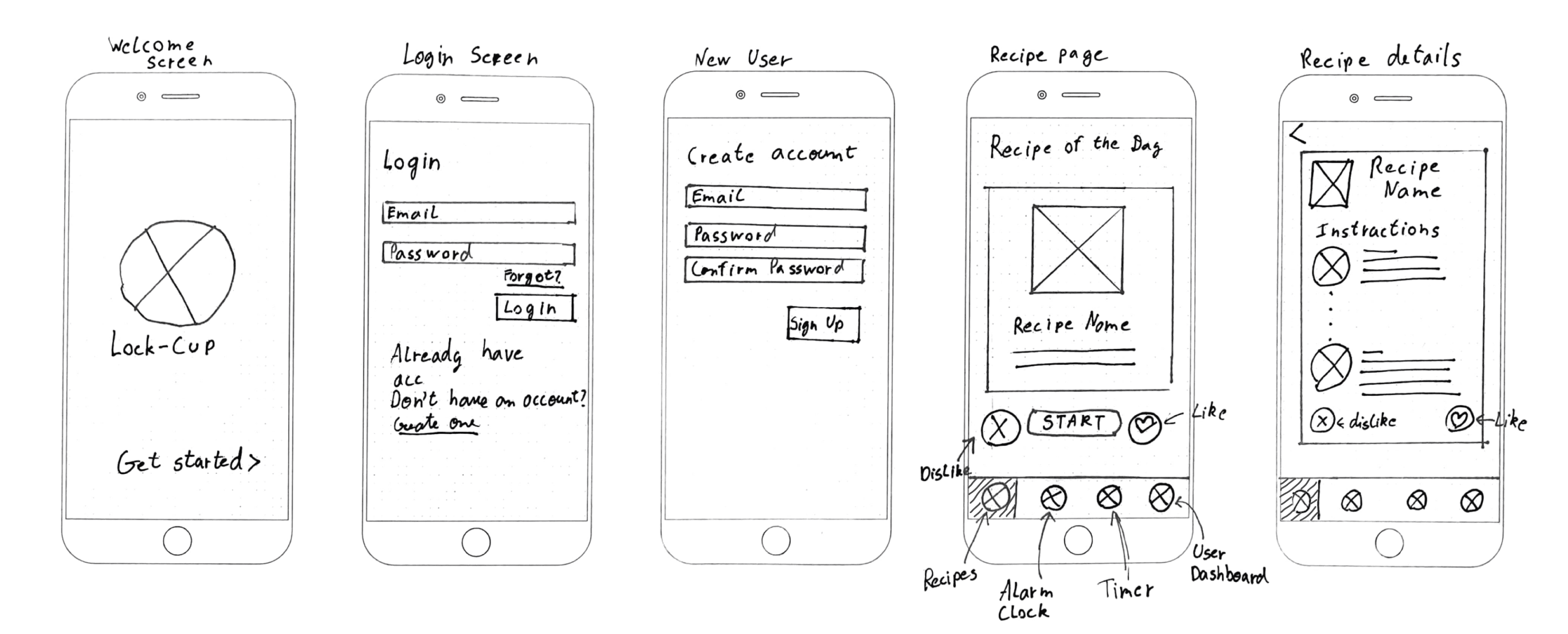
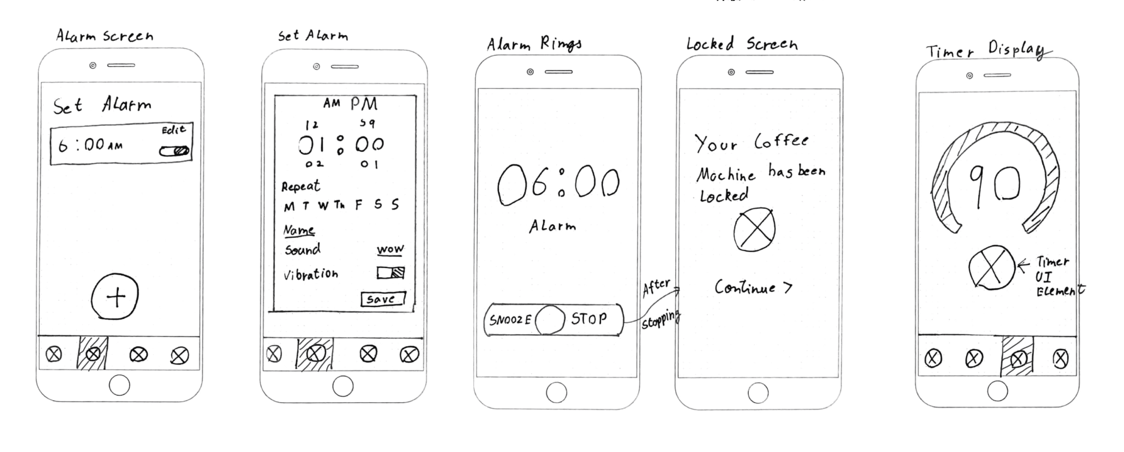
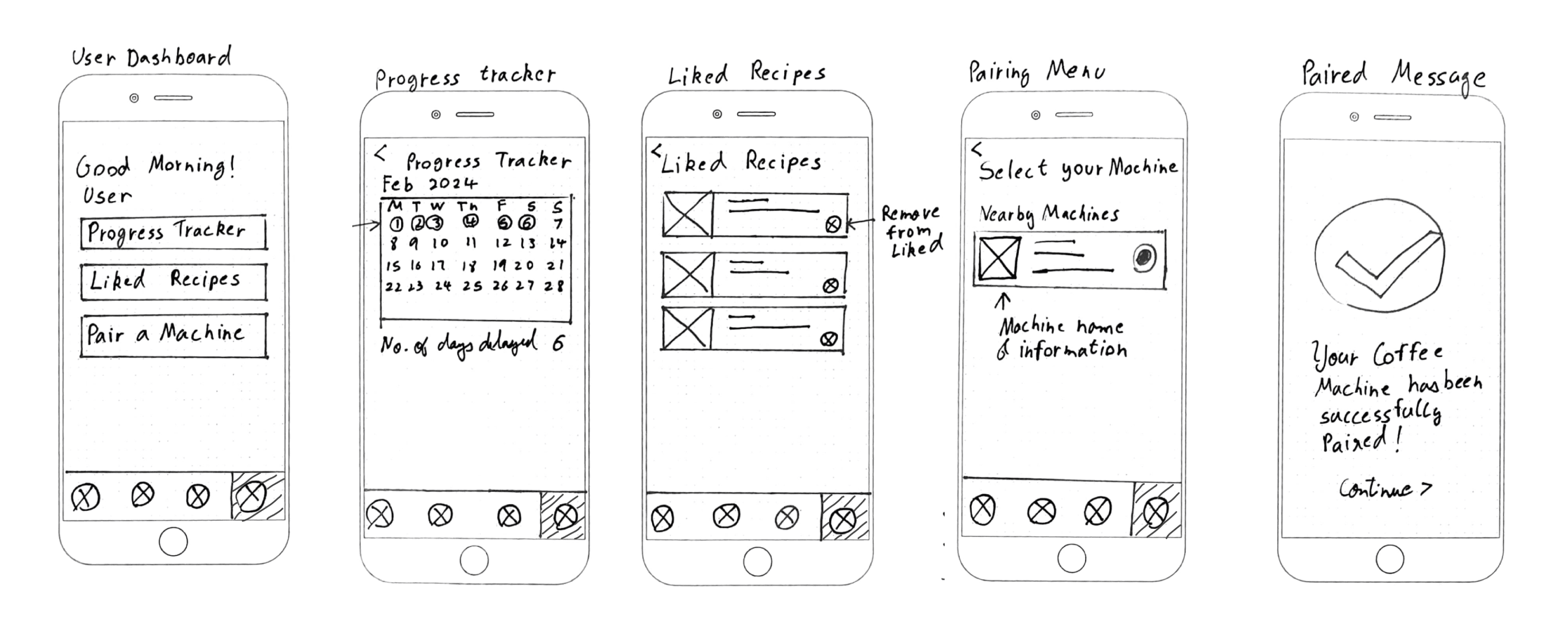
Wireframing
Wireframing
Sketching out the core experience before diving into visual design
Sketching out the core experience before diving into visual design
I began with low-fidelity sketches to quickly explore ideas, then translated the strongest concepts into digital wireframes. This stage helped refine layouts, navigation, and feature placement before visual design began.
I began with low-fidelity sketches to quickly explore ideas, then translated the strongest concepts into digital wireframes. This stage helped refine layouts, navigation, and feature placement before visual design began.

Branding
Branding
Designing a brand that feels calm, supportive, and habit-focused
Designing a brand that feels calm, supportive, and habit-focused
Lock-Cup is more than a utility. It is a morning companion. The brand needed to feel calm, supportive, and habit-focused.
Lock-Cup is more than a utility. It is a morning companion. The brand needed to feel calm, supportive, and habit-focused.

Key choices:
Name: Clear yet curious, hinting at control but inviting exploration.
Typography: Rounded, friendly typefaces (Roobert, Be Vietnam) for approachability.
Color palette: Dark backgrounds for early mornings, paired with warm neutrals and soft highlights.
Tone of voice: Encouraging, celebrating progress rather than enforcing rules.
UI Design
UI Design
Designing an interface that makes progress feel easy
& rewarding
Designing an interface that makes progress feel easy
& rewarding
The interface follows the same philosophy: minimal, warm, and supportive. The goal was to avoid anything that felt clinical or restrictive. Every screen was designed to create a sense of calm and control while reinforcing progress.
The interface follows the same philosophy: minimal, warm, and supportive. The goal was to avoid anything that felt clinical or restrictive. Every screen was designed to create a sense of calm and control while reinforcing progress.


Key design decisions included:
Dark mode by default to reduce early morning eye strain and promote a cozy, calm vibe.
Rounded UI elements to soften the experience and remove any perception of strictness.
Progress ring and calendar visuals to make delayed coffee feel like an accomplishment.
Subtle motion in key areas like the “New Recipe” button to improve discoverability.
Clear icon labeling to improve clarity and build user confidence.
The result is an app that guides users through a healthier routine without overwhelming them.
The result is an app that guides users through a healthier routine without overwhelming them.
Usability Testing
Usability Testing
Five users, real routines, and honest feedback that shaped the final design.
Five users, real routines, and honest feedback that shaped the final design.
I conducted usability testing to evaluate how easily users could navigate the core flows, understand the features, and interact with key elements like the timer, recipe shuffle, and progress tracker.
I conducted usability testing to evaluate how easily users could navigate the core flows, understand the features, and interact with key elements like the timer, recipe shuffle, and progress tracker.
Key Metrics
Participants
5
Testing Time
30m
Tasks / Test
7
Average Confidence
Avg Confidence
84%
Issues
2
Success Rate
91%
Participants were screened based on one primary behavior: drinking coffee within 30 minutes of waking up. This helped ensure relevance and focus when testing how Lock-Cup could influence their routines.
Participants were screened based on one primary behavior: drinking coffee within 30 minutes of waking up. This helped ensure relevance and focus when testing how Lock-Cup could influence their routines.
Findings & Insights
While the overall experience was well-received, a few usability issues surfaced:
While the overall experience was well-received, a few usability issues surfaced:
Issues
Severity
Insight
Shuffle button unclear
High
Users were unsure what the icon did or if it would reset their progress
New recipe button was too subtle
Medium
Several users didn’t notice it without visual prompts
Timer icon lacked clarity
Medium
Users expected more guidance or text to explain its function
What Users Enjoyed Most
Small wins matter
Users responded more to streaks and subtle encouragement than rewards.
“I love that I can track my streak. It’s like I earned my coffee today” – Participant 2
“I love that I can track my streak. It’s like I earned my coffee today”
– Participant 2
The lock was loved
Participants described the lock as “satisfying” and “strangely fun.”
“It’s weird, but locking the machine kind of made it fun” – Participant 5
“It’s weird, but locking the machine kind of made it fun”
– Participant 5
Design Improvements
Design Improvements
Turning feedback into thoughtful product decisions
Turning feedback into thoughtful product decisions
After usability testing, I prioritized the feedback from participants and iterated on the UI to improve clarity, discoverability, and user confidence. Each change addressed a specific problem surfaced during testing, from unclear icons to missing affordances.
After usability testing, I prioritized the feedback from participants and iterated on the UI to improve clarity, discoverability, and user confidence. Each change addressed a specific problem surfaced during testing, from unclear icons to missing affordances.
Here’s a breakdown of the key design improvements I made:
Here’s a breakdown of the key design improvements I made:
Improving Visibility of the New Recipe CTA
P1
P3
P4
P5

Issue

The CTA button was frequently overlooked
Users missed the “New Recipe” button, especially on first use, due to its static design and lack of visual prominence.


Solution
Solution
Added subtle motion to draw attention without clutter
A shine animation made the button more noticeable while maintaining the clean, minimal aesthetic—leading to higher engagement.
Clarifying Shuffle Functionality with Icon and Labels
Clarifying Shuffle Functionality with Icon
and Labels
P2
P3
P5


Issue
Issue
The shuffle icon caused confusion
Users weren’t sure what it did—some thought it reset progress, while others didn’t connect it to switching recipes.

Solution

Solution
Improved clarity with new icon and labels
Replaced the icon with a clearer “randomize” symbol and added text labels for Shuffle and Like. This boosted user understanding and confidence when interacting with the card controls.
Future Improvements
Future Improvements
Ideas to explore in the next iteration
Ideas to explore in the next iteration
While the MVP focused on habit-forming essentials, several opportunities emerged during testing and reflection to take Lock-Cup even further:
While the MVP focused on habit-forming essentials, several opportunities emerged during testing and reflection to take Lock-Cup even further:
01
Onboarding Instructions
Quick, engaging splash screens could help new users understand the app’s purpose and avoid confusion in their first use.
02
Motivation Boost
Visualizing adenosine levels (low, moderate, optimal) could encourage users to wait for the ideal
brewing window.
03
Seamless Navigation
Swipe gestures on recipe cards could offer a more fluid, intuitive way to explore suggestions compared to the current shuffle button.
04
Emergency Brews
An “emergency unlock” feature would give users an out when they really need caffeine, with tradeoff like losing a streak to keep the habit loop intact.
Lessons Learned
Lessons Learned
What I took away from building Lock-Cup
What I took away from building Lock-Cup
Lock-Cup showed me that meaningful habit change is less about restriction and more about small, supportive moments that add up to real behavior shifts.
It was an awesome opportunity to grow my thinking around product behavior, user research, and designing for habits. Here’s what stuck with me:
Lock-Cup showed me that meaningful habit change is less about restriction and more about small, supportive moments that add up to real behavior shifts.
It was an awesome opportunity to grow my thinking around product behavior, user research, and designing for habits. Here’s what stuck with me:

Avoiding Bias
I realized how easy it is to accidentally influence users. I learned to ask neutral questions and let their behavior speak for itself.


Users Will Surprise You
Even in a simple prototype, people interacted with things I didn’t expect. Like tapping, or avoiding elements that felt "obvious" to me.
Less Is Really More
Designing around the Hook model meant stripping the experience down to only the features that mattered!


More where this came from!
More where this came from!


Explore other projects where I design products at the intersection of behavior, systems, and real-world constraints.
Explore other projects where I design products at the intersection of behavior, systems, and real-world constraints.


2026 Adarsh Mokashi. All Rights Reserved.
Designed with

UX textbooks,

gaming breaks, and a sprinkle of

chaos.
2026 Adarsh Mokashi. All Rights Reserved.
Designed with
UX textbooks,
gaming breaks, and a sprinkle of
chaos.
2026 Adarsh Mokashi. All Rights Reserved.
Designed with
UX textbooks,
gaming breaks, and a sprinkle of
chaos.