Academic Project
16 weeks
Jan 2024
Role: Product Designer


He says
“I want to try healthier habits, but when I wake up, I’m not in the mood to think or decide anything.”
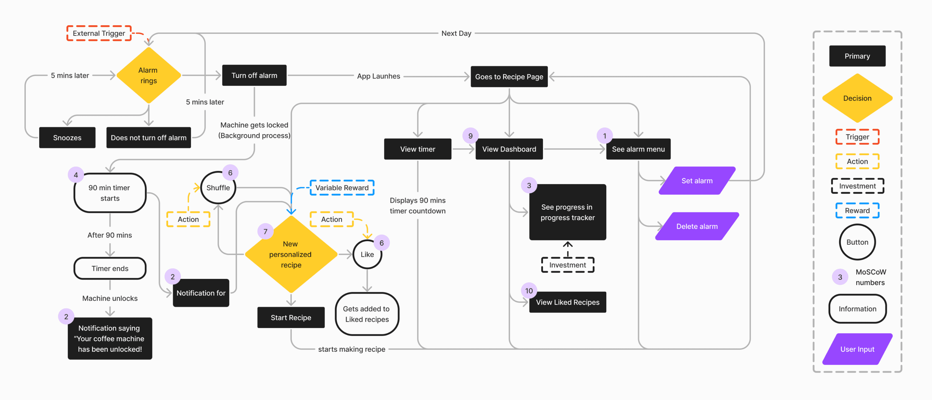
Trigger

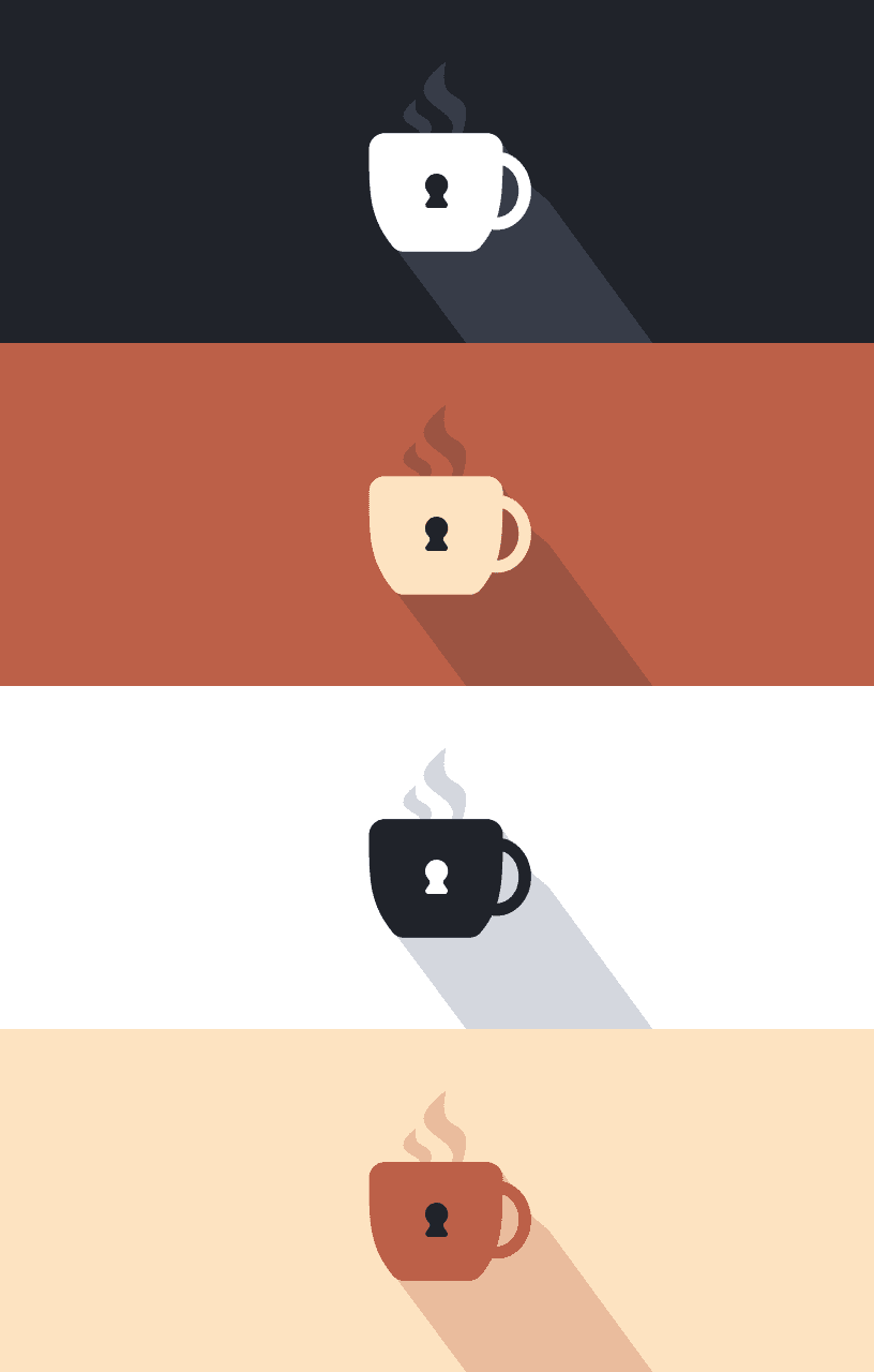
Ryan wakes up from the Lock-Cup alarm and sees that his coffee machine is locked.
Action

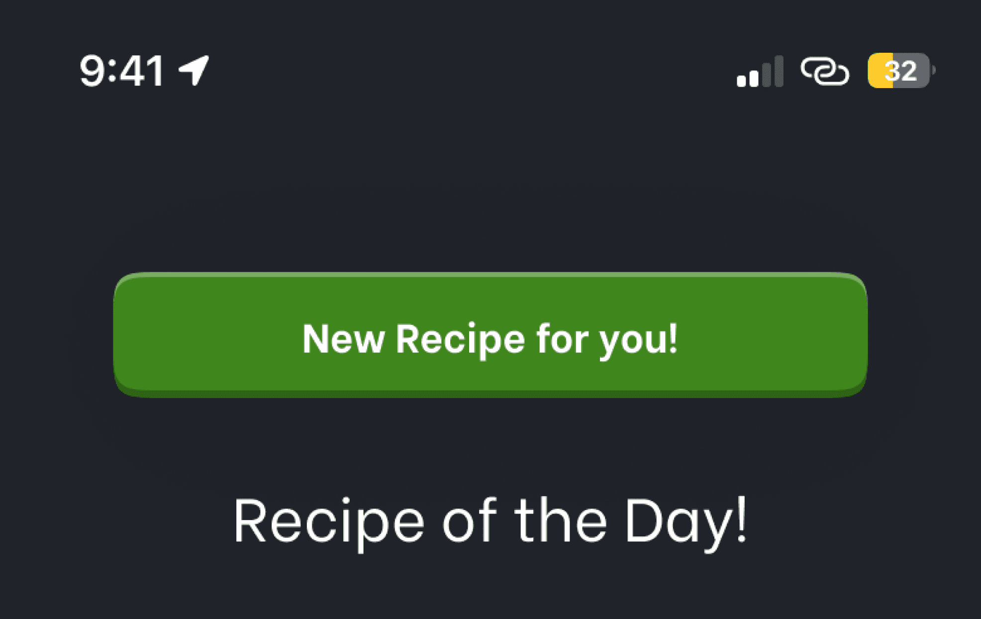
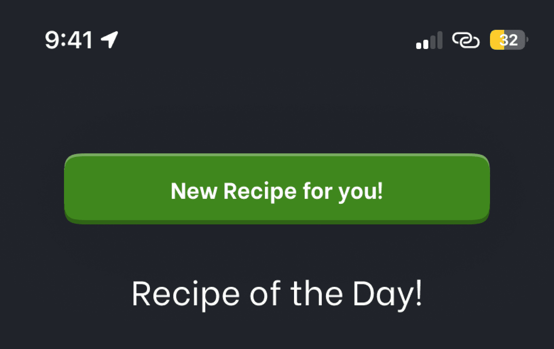
After turning off the alarm, the recipe page opens. He can like or shuffle recipes to teach the app what he enjoys.
Variable Reward

Ryan receives a new personalized recipe everyday based on his preferences.
Investment

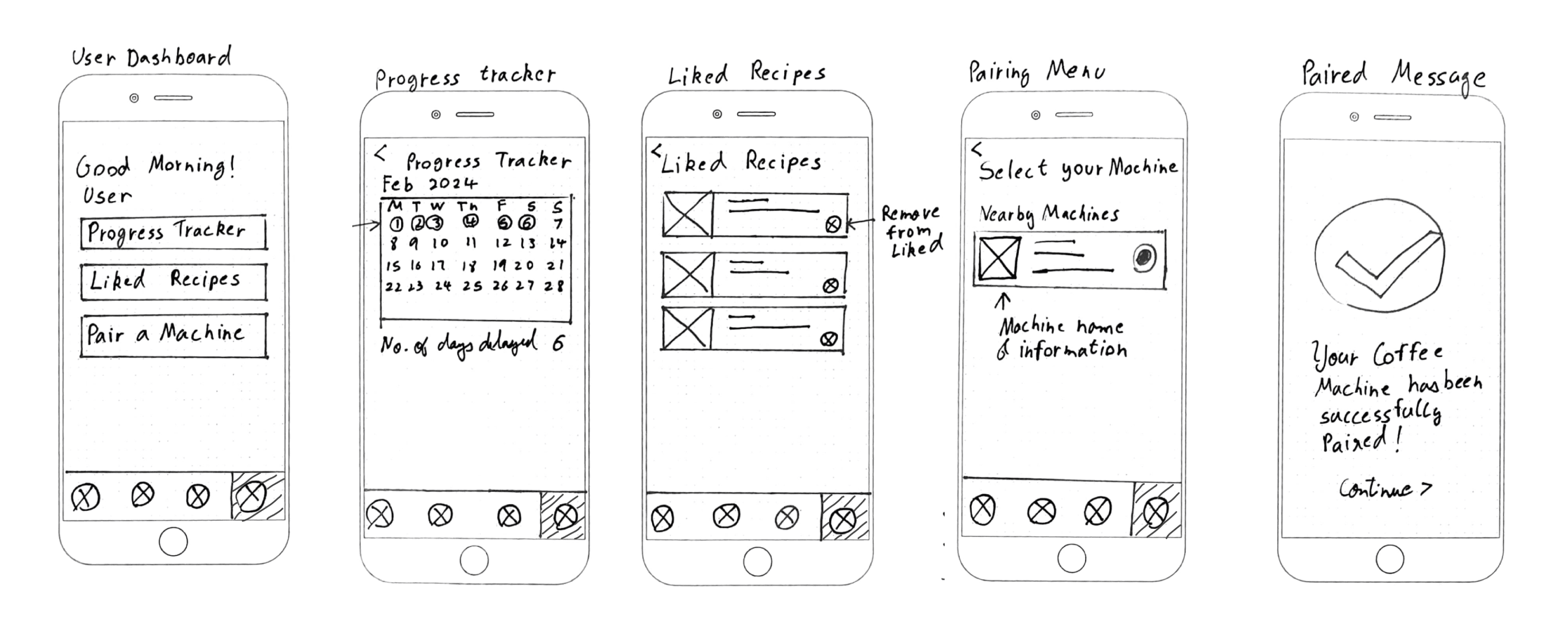
He can track his progress within the app, to see the number of days he delayed his coffee, to create a sense of accomplishment.
Must Have
Could Have
Should Have
Won’t Have
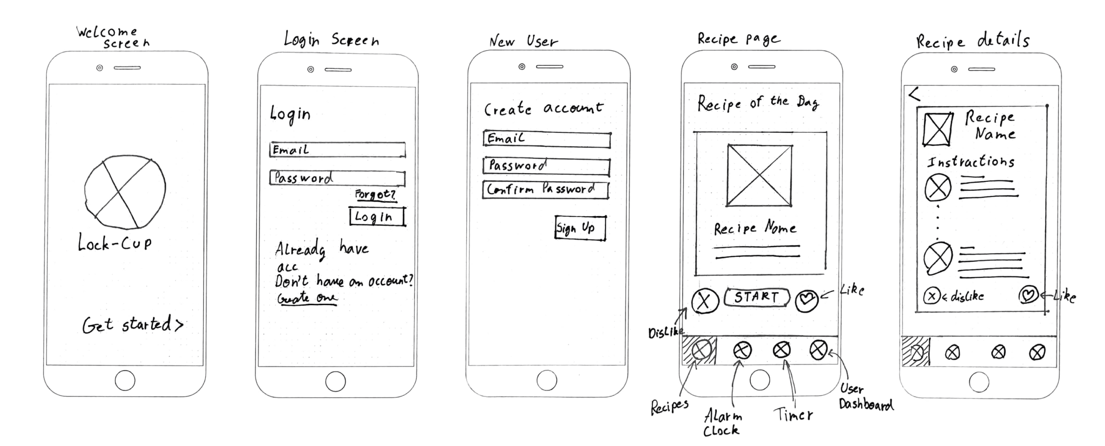
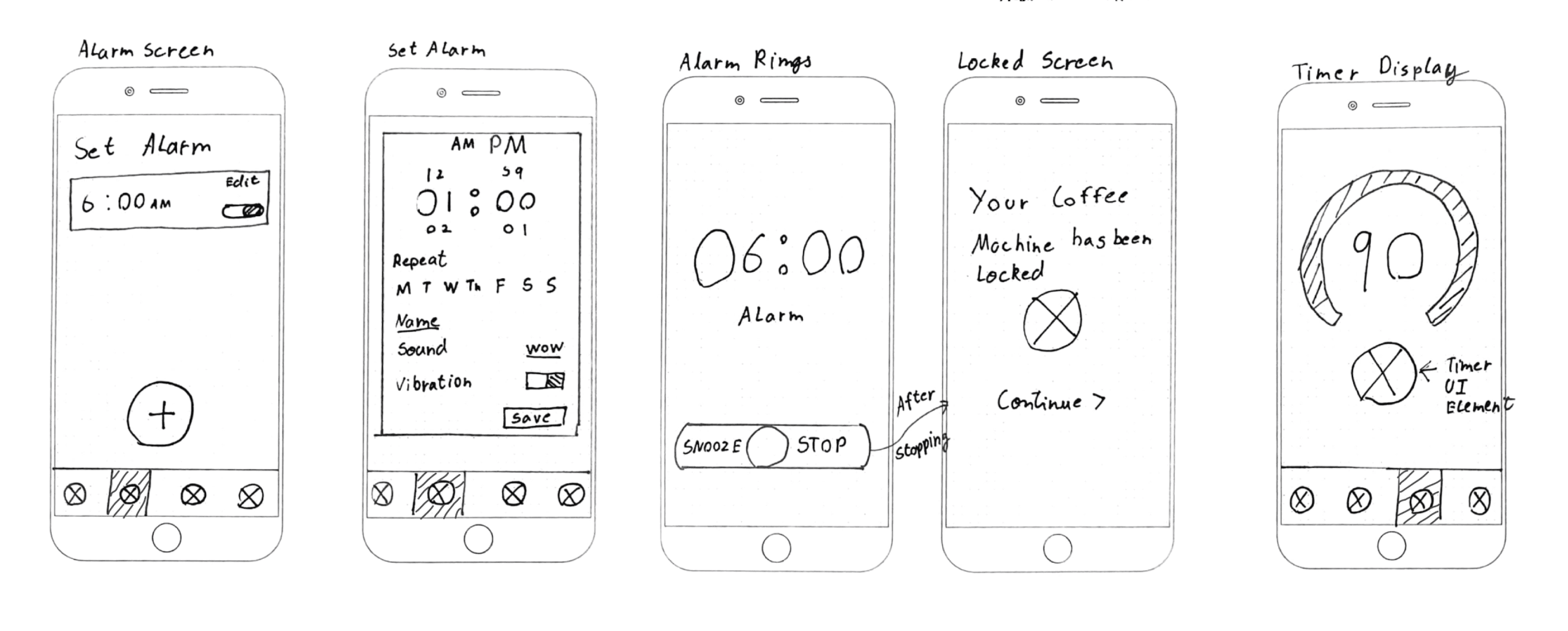
Alarm Clock
1
Description
Basic
Performance
Delighter
Alarm clock functionality which the coffee machine will use in order to know when the user gets up
T

Progress Tracker
3
Description
Basic
Performance
Delighter
A feature where the user can see the number of days they delayed their coffee, creating a sense of accomplishment.
I

Recipe Feedback
6
Description
Basic
Performance
Delighter
The user can either like or dislike recipes according to their liking
A
Liked Recipes
10
Description
Basic
Performance
Delighter
User can save any recipe by liking it, so they can make it again
Personalized recipes
7
Description
Basic
Performance
Delighter
User will get new personalized recipes based on their likes and dislikes
R
User Dashboard
9
Description
Basic
Performance
Delighter
A dashboard for the user containing liked recipes, progress tracker
pairing menu
14
Description
Basic
Performance
Delighter
A pairing menu to pair the app with the coffee machine to avoid friction in user experience
Coffee Mug Render
11
Description
Basic
Performance
Delighter
A 3D render of the coffee mug in the app interface
Recipe Upload
12
Description
Basic
Performance
Delighter
Users can create and upload recipes for others to see. The most liked recipe for a month could get a reward
I
Coffee Machine UI
13
Description
Basic
Performance
Delighter
The coffee machine can have a UI to match the app and show the timer as well

Onboarding Screens
15
Description
Basic
Performance
Delighter
Splash screens for users to understand how the app works
unlock feature
8
Description
Basic
Performance
Delighter
An unlock feature which the users can use in times of emergency
Referrals
16
Description
Basic
Performance
Delighter
A referral feature to earn bonus rewards can be implemented
I
Subscription service
18
Description
Basic
Performance
Delighter
A subscription based model for premium features
R
points system
19
Description
Basic
Performance
Delighter
The user can be given some points for completion of goals
I
Leaderboards
20
Description
Basic
Performance
Delighter
A leaderboard feature showing where the user stands among others
R

Key Metrics
Participants
5
Testing Time
30m
Tasks / Test
7
84%
Issues
2
Success Rate
91%
Findings & Insights
Issues
Severity
Insight
Shuffle button unclear
High
Users were unsure what the icon did or if it would reset their progress
New recipe button was too subtle
Medium
Several users didn’t notice it without visual prompts
Timer icon lacked clarity
Medium
Users expected more guidance or text to explain its function
What Users Enjoyed Most
Small wins matter
Users responded more to streaks and subtle encouragement than rewards.
“I love that I can track my streak. It’s like I earned my coffee today” – Participant 2
The lock was loved
Participants described the lock as “satisfying” and “strangely fun.”
“It’s weird, but locking the machine kind of made it fun” – Participant 5
Clarity is everything
Even minor visual elements like shuffle icons caused confusion.
“I wasn’t sure what the shuffle icon did. I was afraid it would reset something” – Participant 1
Improving Visibility of the New Recipe CTA

The CTA button was frequently overlooked
Users missed the “New Recipe” button, especially on first use, due to its static design and lack of visual prominence.

Added subtle motion to draw attention without clutter
A shine animation made the button more noticeable while maintaining the clean, minimal aesthetic—leading to higher engagement.
Clarifying Shuffle Functionality with Icon and Labels

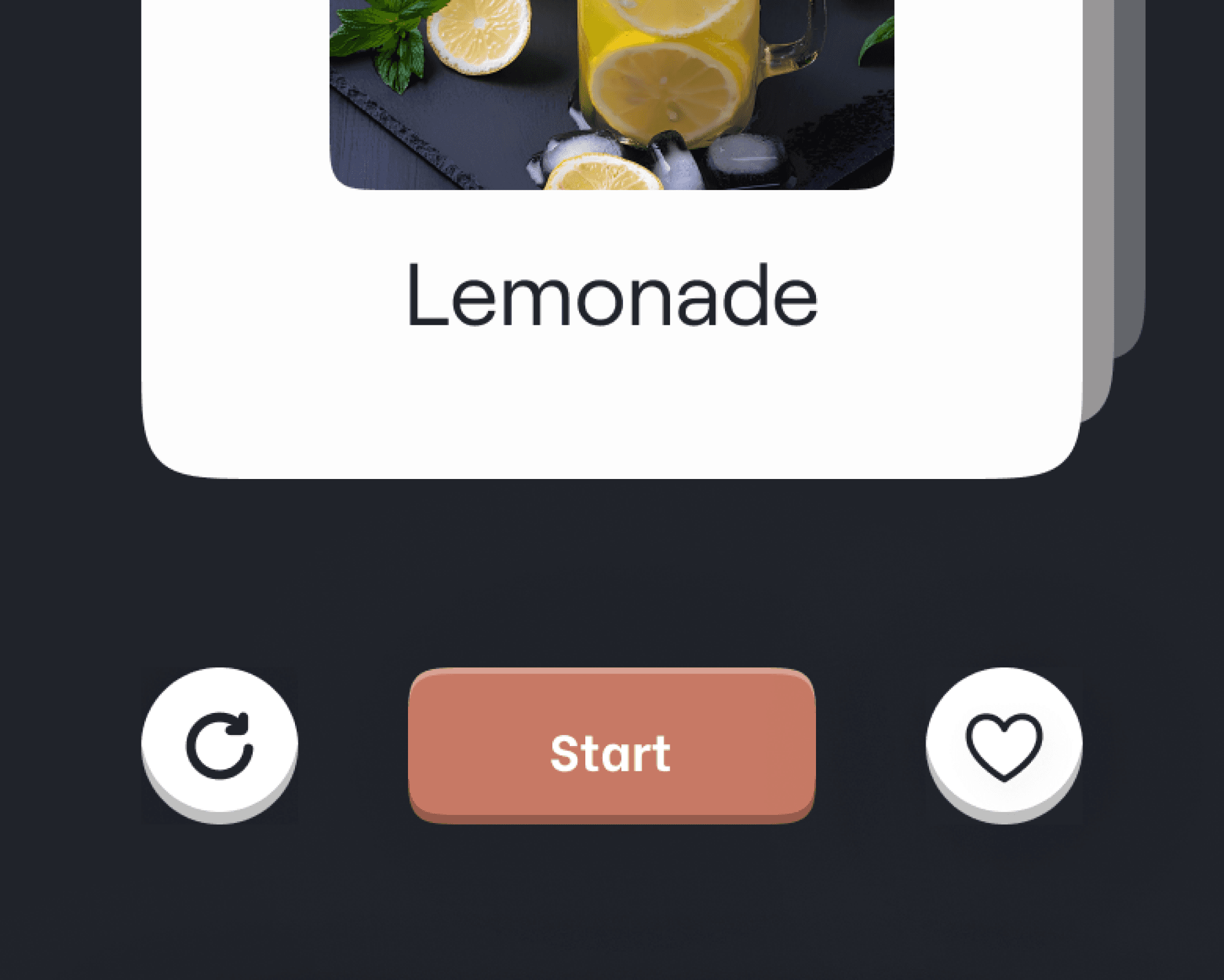
Issue
The shuffle icon caused confusion
Users weren’t sure what it did—some thought it reset progress, while others didn’t connect it to switching recipes.

Solution

Improved clarity with new icon and labels
Replaced the icon with a clearer “randomize” symbol and added text labels for Shuffle and Like. This boosted user understanding and confidence when interacting with the card controls.
01
Onboarding Instructions
Quick, engaging splash screens could help new users understand the app’s purpose and avoid confusion in their first use.
02
Motivation Boost
Visualizing adenosine levels (low, moderate, optimal) could encourage users to wait for the ideal
brewing window.
03
Seamless Navigation
Swipe gestures on recipe cards could offer a more fluid, intuitive way to explore suggestions compared to the current shuffle button.
04
Emergency Brews
An “emergency unlock” feature would give users an out when they really need caffeine, with tradeoff like losing a streak to keep the habit loop intact.
Lessons Learned
Avoiding Bias
During tests, I realized how easy it is to accidentally influence users. I learned to ask neutral questions and let their behavior speak for itself.
Users Will Surprise You
Even in a simple prototype, people interacted with things I didn’t expect — tapping, interpreting, or avoiding elements that felt "obvious" to me.
Less Is Really More
Designing around the Hook model meant stripping the experience down to only what mattered. Prioritizing simplicity was often harder but worth it!

Adarsh Mokashi
About
My work
Resume
Contact